Design components - Design guide
Each style includes a Correct use section. By adhering to the style's intended purpose(s), any future changes in the stylesheets will have predictable outcomes.
Table of contents
- Grids
- Screen size show and hide
- Font size
- Font colour
- Font family
- Tables
- Forms
- Lists
- Images
- Keyboard keys
- Background colours
- Buttons
- Icons
- Borders
- Margins and indents
- Floats
- Clearing floats
- Horizontal alignment
- Vertical alignment
- Line height
- No wrapping
- Display options
- Opacity
- Position
- Badges
- Invisible
- Thermometer
- Date
- Columns
- Modules
- Message box modules
Grids
Refer to: Layout: Grids
Screen size show and hide
Refer to: Layout: Screen size show and hide
Font size
Font sizes change be changed.
Correct use
- Use when modifications to the default design increase the value to the user and/or content experience.
- Avoid using this CSS for strictly cosmetic or decorative purposes.
Font colour
Font colours change be changed.
Correct use
- Use when modifications to the default design increase the value to the user and/or content experience.
- Avoid using this CSS for strictly cosmetic or decorative purposes.
Font family
Font families change be changed.
Correct use
- Use when modifications to the default design increase the value to the user and/or content experience.
- Avoid using this CSS for strictly cosmetic or decorative purposes.
Tables
Table designs can be changed.
Correct use
- Use when modifications to the default design increase the value to the user and/or content experience.
- Avoid using this CSS for strictly cosmetic or decorative purposes.
- Refer to: Tables - Optimal Content Examples
Forms
Forms can be laid out in various ways
Correct use
- Labels should be above input fields or right aligned to them. Refer to: Form layout
- Refer to: Forms - Optimal Content Examples
Lists
Lists bullets change be changed.
- Un-ordered lists — use if information has no sequence. This is the default list-type.
- Ordered lists — use if the information requires specific order or emphasis, as in a set of procedures. There are three types of ordered lists:
- Arabic numeral (for example, 1, 2, 3) — mainly use these to format ordered lists.
- Alpha (for example, A, B, C or a, b, c) — use mainly as a sub-point in an ordered listing, for example point 1a, 2b etcetera.
- Roman numeral (for example, I, II, III, or i, ii, iii) — use mainly in legal documentation or in the second and third levels of numeric lists.
- Definition lists — use if information contains terms and definitions, or ties together any items that have a direct relationship with each other.
Correct use
- Use the correct list type when formatting content.
- Use when modifications to the default design increase the value to the user and/or content experience.
- Avoid using this CSS for strictly cosmetic or decorative purposes.
Demo
- default unordered bullet
- no bullet
- default ordered bullet
- alpha bullet
- roman bullet
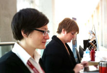
Images
Images can be a great thing. According to Sandra Niehaus, VP User Experience and Creative Director at Closed Loop Marketing, images require less cognitive processing to recognize and understand than text.
Images also do the following:
- help users perceive information faster than text,
- enable users to remember information better than text,
- communicate more information with less text,
- help users make decisions by providing additional information,
- define and distinguish various information groups,
- increase a site's credibility and appeal, and
- reduce cognitive load.
Furthermore, while users with visual impairments will need a text equivalent, images add tremendous value to users with visual comprehension deficits, like dyslexia.
Correct use
- Images can positively and negatively impact the site and the content. Refer to: Images - Content formatting
- Refer to: Images - Optimal Content Examples

Keyboard keys
Keyboard keys are represented by the <kbd> element.
Correct use
- When referring to keyboard keys, use the <kbd> element.
- Avoid using words like click or press when referring to keyboard instructions as users with assistive technologies may not use a keyboard. Consider using select instead.
Demo
Shift Ctrl EnterBackground colours
Background colours change be changed.
Correct use
- Use when modifications to the default design increase the value to the user and/or content experience.
- Avoid using this CSS for strictly cosmetic or decorative purposes.
Buttons
Links, form inputs and form buttons can all be made to look like a button.
Correct use
- Use when modifications to the default design increase the value to the user and/or content experience.
- Avoid using this CSS for strictly cosmetic or decorative purposes.
Icons
Icons can be added.
Correct use
- Since the icons are CSS background images, they cannot have an alt attribute. Therefore, the icon must be accompanied by actual text to ensure that there is no loss of information for the visually impaired user.
- Use when modifications to the default design increase the value to the user and/or content experience.
- Avoid using this CSS for strictly cosmetic or decorative purposes.
- Refer to: Images - Optimal Content Examples
Borders
Borders can be added.
Correct use
- Use when modifications to the default design increase the value to the user and/or content experience.
- Avoid using this CSS for strictly cosmetic or decorative purposes.
Margins and indents
Margins can be adjusted, indents can be added. The space to the left of an element is the indent. The space above, below and to the right is the margin. All four sides can be adjusted.
Correct use
- All content is left aligned to the container it resides in. Use when modifications to the default design increase the value to the user and/or content experience.
- Avoid using this CSS for strictly cosmetic or decorative purposes.
Floats
Content can be floated left or right.
Correct use
- All content is left aligned to the container it resides in. Use when modifications to the default design increase the value to the user and/or content experience.
- Avoid using this CSS for strictly cosmetic or decorative purposes.
Clearing floats
Prevent subsequent content from floating.
Correct use
- To prevent elements from floating.
- Avoid using this CSS for strictly cosmetic or decorative purposes.
Horizontal alignment
Content can be horizontally aligned left, center or right.
Correct use
- All content is left aligned to the container it resides in. Use when modifications to the default design increase the value to the user and/or content experience.
- Avoid using this CSS for strictly cosmetic or decorative purposes.
Vertical alignment
Content can be vertically aligned top, middle or bottom.
Correct use
- Use when modifications to the default design increase the value to the user and/or content experience.
- Avoid using this CSS for strictly cosmetic or decorative purposes.
Demo
| Header | Header |
|---|---|
| Data data data data data data data data data data data data | data aligned bottom |
| Data data data data data data data data data data data data | data aligned middle |
Line height
Line height can be changed.
Correct use
- Use when modifications to the default design increase the value to the user and/or content experience.
- Avoid using this CSS for strictly cosmetic or decorative purposes.
Demo
- Default line height
- Default line height
- Increased line height
- Increased line height
No wrapping
Text can be prevented from wrapping to the next line.
Correct use
- Use when modifications to the default design increase the value to the user and/or content experience.
- Avoid using this CSS for strictly cosmetic or decorative purposes.
Demo
Both dates are inside a box that is 20% wide but the second example prevents wrapping:
January 1, 2013
January 1, 2013
Display options
Most styles are have their display attribute as block, inline or inline-block. CSS can be used to override the default.
Correct use
- Use when modifications to the default design increase the value to the user and/or content experience.
- Avoid using this CSS for strictly cosmetic or decorative purposes.
Width
Width can be changed.
Correct use
- Use when modifications to the default design increase the value to the user and/or content experience.
- Avoid using this CSS for strictly cosmetic or decorative purposes.
Opacity
Borders can be added.
Correct use
- Ensure that there is enough contrast between the foreground and the background. Refer to: Colour - Optimal Content Examples
- Use when modifications to the default design increase the value to the user and/or content experience.
- Avoid using this CSS for strictly cosmetic or decorative purposes.
 Normal opacity
Position
Items can be positioned on top of other items.
Correct use
- Ensure that there is enough contrast between the foreground and the background. Refer to: Colour - Optimal Content Examples
- Use when modifications to the default design increase the value to the user and/or content experience.
- Avoid using this CSS for strictly cosmetic or decorative purposes.
Demo
Content is behind. Content is behind. Content is behind. Content is behind. Content is behind.
Content is on top
Badges
Draw attention to a some keyword trigger text. This acts as a teaser to the information that immediately follows/precedes.
Correct use
- Should only contain a maximum of a few trigger words.
- It is a teaser to the information follows or precedes it.
- Use when modifications to the default design increase the value to the user and/or content experience.
- Avoid using this CSS for strictly cosmetic or decorative purposes.
Invisible
Content can be made invisible on the screen, yet is still read by users with assistive technologies.
Correct use
- To make links descriptive if there is a need for simplified or undescriptive link text on the screen.
- To add extra information or instructions that target users with screen readers.
- Refer to: Links - Optimal Content Examples
Demo
The below link actually says "Page 1 of search results" even though most of it is invisible to you and you just see the "1".
Remove specific content from the printed copy.
Correct use
- Only apply to content that adds absolutely not print value to the user, like supporting menus etc.
Thermometer
Add a thermometer image.
Correct use
- The image cannot be the sole way of communicating the information. Text must appear above the image which then allows the image to support the text.
- Use when modifications to the default design increase the value to the user and/or content experience.
- Avoid using this CSS for strictly cosmetic or decorative purposes.
Date
Display a single date.
Correct use
- Only use with a single date, not a date range.
- Use when modifications to the default design increase the value to the user and/or content experience.
- Avoid using this CSS for strictly cosmetic or decorative purposes.
Columns
Create columns of content.
Correct use
- Use to transform a single column of content into two, three or four columns. However, this feature uses the CSS3
column-countattribute. IE9 and lower will display the content in a single column, as these browsers do not support column-count. - Use when modifications to the default design increase the value to the user and/or content experience.
- Avoid using this CSS for strictly cosmetic or decorative purposes.
Module
Put any content in a generic box.
Correct use
- Use when modifications to the default design increase the value to the user and/or content experience.
- Avoid using this CSS for strictly cosmetic or decorative purposes.
Related module
Feature links to that are related to the current topic.
Correct use
- Use the module-related class to feature a list of links that point to related Web pages.
- This module is typically located on the right.
- Avoid using this CSS for strictly cosmetic or decorative purposes.
Billboard module
Create a billboard of links, mixing text with images.
Correct use
- Feature links to short-term specialty (announcements, general interest) and newsworthy pages (stories, events and happenings). Do not place permanent links in this module as it is for temporarily listings only. It is not intended to be used as a graphical menu system to supplement or substitute permanent navigation. This ensures that the billboard remains relevant and that users continue to notice the evergreen items.
- Avoid using this CSS for strictly cosmetic or decorative purposes.
Demo
Note: Limited display in IE7/8.
Menu section module
Creates a supplementary menu.
Correct use
- Use as a supplementary menu that follows the user throughout a section of the site.
- Avoid using this CSS for strictly cosmetic or decorative purposes.
Table of contents
Create a standard table of contents.
Correct use
- Alignment is always on the left of the page.
- Place at or near the of any page that scrolls when viewed at a 1024x768 screen resolution (unless scrolling is minimal, and adding a Table of contents is no value to the user).
- Links are usually to anchors on the same page, although a table of contents can reside on its own page with the links taking the user to anchor on a different page.
- Links targets must either all point to anchors on the same page or to anchors on a new page. A single table of contents cannot point to both same page anchors as well as new page anchors.
Note
Although this module is the primary way to display a table of contents, it is not the only option. For example, an A to Z index at the top of the page can also act as a table of contents on a page that is sorted alphabetically. So the correct use list applies to any table of contents, regardless of which design effect or CSS style is used.
Poster module
Features a large image and a caption.
Correct use
- Must include an image and supporting text.
- Use when modifications to the default design increase the value to the user and/or content experience.
- Avoid using this CSS for strictly cosmetic or decorative purposes.
Contact module
Features basic contact information (complex information should use a regular table).
Correct use
- Use for simply contact information. Complex information would likely use a table.
- Use when modifications to the default design increase the value to the user and/or content experience.
- Avoid using this CSS for strictly cosmetic or decorative purposes.
Demo
613-222-1111
613-222-2222
News module
Features an article or story.
Correct use
- Use to feature an article or story. Do not use for general information.
- Use when modifications to the default design increase the value to the user and/or content experience.
- Avoid using this CSS for strictly cosmetic or decorative purposes.
Demo

Spotlight module
Showcases a list of links to articles or stories.
Correct use
- Use on a list of links that showcase links to articles or stories.
- Use when modifications to the default design increase the value to the user and/or content experience.
- Avoid using this CSS for strictly cosmetic or decorative purposes.
Demo
 Link text
Comment module
Features a user's comments and responses
Correct use
- Use on a list of user comments.
- Use when modifications to the default design increase the value to the user and/or content experience.
- Avoid using this CSS for strictly cosmetic or decorative purposes.
Alert module
An alert module can be added.
Correct use
- Use the the module-alert class to alert the user to important temporary information, for example systems are down, error messages, or here is a pending change to X. There is no set definition for what temporary means, however, there is an expectation that this type of information is very short-term.
- The icon is purely decorative and cannot be solely relied on to communicate the importance of this message.
- Use when modifications to the default design increase the value to the user and/or content experience.
- Avoid using this CSS for strictly cosmetic or decorative purposes.
Attention module
An attention module can be added.
Correct use
- Use the module-attention class to call attention to important information.
- The icon is purely decorative and cannot be solely relied on to communicate the importance of this message.
- Use when modifications to the default design increase the value to the user and/or content experience.
- Avoid using this CSS for strictly cosmetic or decorative purposes.
Note module
An note module can be added.
Correct use
- Use the module-note class to call attention to a feature-worthy information, for example notes or advisories.
- The icon is purely decorative and cannot be solely relied on to communicate the importance of this message.
- Use when modifications to the default design increase the value to the user and/or content experience.
- Avoid using this CSS for strictly cosmetic or decorative purposes.
Information module
An information module can be added.
Correct use
- Use the module-info class to call attention to a feature-worthy information.
- The icon is purely decorative and cannot be solely relied on to communicate the importance of this message.
- Use when modifications to the default design increase the value to the user and/or content experience.
- Avoid using this CSS for strictly cosmetic or decorative purposes.
Question module
A question module can be added.
Correct use
- Use the module-question class to feature a question.
- The icon is purely decorative and cannot be solely relied on to communicate the importance of this message.
- Use when modifications to the default design increase the value to the user and/or content experience.
- Avoid using this CSS for strictly cosmetic or decorative purposes.
Answer module
An answer module can be added.
Correct use
- Use the module-answer class to feature an answer.
- The icon is purely decorative and cannot be solely relied on to communicate the importance of this message.
- Use when modifications to the default design increase the value to the user and/or content experience.
- Avoid using this CSS for strictly cosmetic or decorative purposes.
Tool module
A tool module can be added.
Correct use
- Use the module-tool class to call attention to a tool or similar solution/product that is featured on the page.
- The icon is purely decorative and cannot be solely relied on to communicate the importance of this message.
- Use when modifications to the default design increase the value to the user and/or content experience.
- Avoid using this CSS for strictly cosmetic or decorative purposes.
Work in progress module
A work in progress module can be added.
Correct use
- Use the module-inprogress class to call attention to content that is in-progress or being worked on.
- The icon is purely decorative and cannot be solely relied on to communicate the importance of this message.
- Use when modifications to the default design increase the value to the user and/or content experience.
- Avoid using this CSS for strictly cosmetic or decorative purposes.
Refer module
A refer module can be added.
Correct use
- Use the module-refer class to drawn attention to the fact that the user is being referred/redirected to another page.
- The icon is purely decorative and cannot be solely relied on to communicate the importance of this message.
- Use when modifications to the default design increase the value to the user and/or content experience.
- Avoid using this CSS for strictly cosmetic or decorative purposes.
Summary module
A summary module can be added.
Correct use
- Use the module-summary class to feature content summaries, recaps and reviews.
- The icon is purely decorative and cannot be solely relied on to communicate the importance of this message.
- Use when modifications to the default design increase the value to the user and/or content experience.
- Avoid using this CSS for strictly cosmetic or decorative purposes.
Archive module
An archive module can be added.
Correct use
- Use the module-archive class to inform the user that the page contains archived information.
- The icon is purely decorative and cannot be solely relied on to communicate the importance of this message.
- Use when modifications to the default design increase the value to the user and/or content experience.
- Avoid using this CSS for strictly cosmetic or decorative purposes.
- Date modified:
3 Comments