Grid system
This page demonstrates grid options when there is a left menu. Alternatively view the: No left menu grid options
Table of contents
Grid overview
Grids have been around for a long time in print publishing, and have now moved to the Web. A grid is an invisible CSS wireframe used to achieve visual cohesion. It's like a lattice that divides space into sections used to hold content such as headings, text, lists, images and so on.
Do you have to use grids?
Nope. Grids are not required when standard content - paragraphs, tables, lists, etc. - is allowed to freely fill the entire content area. Grids are only necessary for positioning and alignment of content. Some examples include:
- a right menu
- a grouping of thumbnails
- anything in columns (except table columns that are generate from the
tableelement) - call out boxes
- alert boxes
- etc.
No left menu
If a pages has no left menu, there are two grid systems that can be used within the page. An 8 column is the default and an optional 12 column can be called in at any location on the page by opening a <div class="grid-12">.
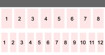
Example page: No left menu grid options
With a left menu
There are two Grid systems that can be used within a page that has a left menu. An 8-column system is the default, however because the left menu occupies the first 2 columns, the content area can occupy only the remaining six columns. An optional 12-column is available at any point on the page by simply opening a <div class="grid-12"> within the content area.
Why is 8 columns the default?
Most complex sites have a left menu. The left menu takes up a certain number of grid cells, leaving the remaining space for the content area. The default design of this Grid system allows for the left menu to be two columns wide while the content area is six.
The content area, with it's six columns, nicely divides into two and three equal columns. As demonstrated below, a 12 column Grid system that has a left menu, cannot divide the content as nicely, as the remaing cells cannot be divided by two, which is a basic design requirement. A 16-column Grid system also has problems, as the remaining space cannot be divided into equal thirds. In fact, the only Grid system that solved all design requirements was a 24-column Grid system, but that seems overcomplicated. Furthermore, text should not be put in the tinest grid cells, like a span-1, and should only be used for indenting purposes or to hold an image so having 24 tiny grid cells was potentially going against accessibility requirements. The WCAG 2.0 requires text to increase up to 200% without breaking the layout and text inside a tiny box cannot effectively do this. Refer to: WCAG 2.0: Success Criterion 1.4.4

Both can divide the content area into thirds.
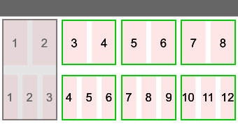

Both can create a right menu the same width as the left menu.
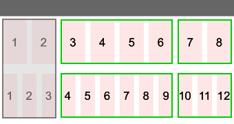

Only one can divide the content area in half.
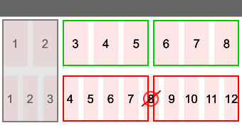
12 column option
A grid-12 living inside of the the default 8 column grid design.
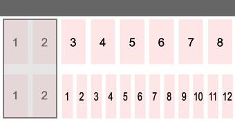
For complex or alternate layouts, you can call in a grid-12 within the content area. Although the default Grid system will likely meet the majority of all needs, this alternate grid version is available and can be easily activated.
Grid structure
When there is a left menu, the Grid system offers two grid layouts for the content area: the six column layout and the twelve column layout.
1
2
3
4
5
6
1
2
3
4
5
6
7
8
9
10
11
12
Grid building blocks
In the same way that a typical browser setting is 1024x768 (not 1025x775), the dimensions below do not always use convenient values as they use the exact value needed for the system to work. A single grid cell has a margin-left and margin-right of 10px. This is known as the gutter.
Furthermore, grid cells have a default margin-top of 0px and a margin-bottom of 20px. This can be increased or decreased by adding the margin proximity CSS.
Note: Grids cells are invisible by default, as they are only structural in nature. For display purposes, we applied a background colour to them.
Six grid columns
span-1
span-2
span-3
span-4
span-5
span-6
Twelve grid columns
span-1
span-2
span-3
span-4
span-5
span-6
span-7
span-8
span-9
span-10
span-11
span-12
Grid rows
To maintain the integrity of each row, you must place a <div class="clear"></div> at the end of each row. This is because grid cells have a float:left property. The clear prevents the next row of grid cells from trying to float up and fill any gaps in the previous row.
A
B
C
D
View code
<div class="span-2">
    <p>A</p>
</div>
<div class="span-2">
    <p>B</p>
</div>
<div class="clear"></div>
<div class="span-2">
    <p>C</p>
</div>
<div class="span-2">
    <p>D</p>
</div>
<div class="clear"></div>
A
B
C
D
View code
<div class="span-2">
    <p>A</p>
</div>
<div class="clear"></div>
<div class="span-2">
    <p>B</p>
</div>
<div class="clear"></div>
<div class="span-2">
    <p>C</p>
</div>
<div class="clear"></div>
<div class="span-2">
    <p>D</p>
</div>
<div class="clear"></div>
Grid dimensions
As per gridsystemgenerator.com (external link) the grid cell dimensions for the responsive design are as follows:
8 column Grid system
When there is a left menu, the left menu accounts for two grid cells, leaving six for the content area.
12 column Grid system
When the columns are the full width of the wireframe: ![]()
- Optional grid-12 dimension in a one column layout: 800x600 (external link)
- Optional grid-12 dimensions in a one column layout: 1024x768 (external link)
- Optional grid-12 dimensions in a one column layout: 1280x720+ (external link)
When the columns are sharing the same horizontal space as a left menu and are only inside the content are of a two column template: 
Important! Design your content to optimize for the 1024x768 viewport. The responsive design will do the rest of the work.
Grid layout
There are 32 base layout options, ranging from a single full width (span-6) to a six column layout (six span-1's). Below are the layout options:
One column
span-6
View code
<div class="span-6">
	<p>Text here</p>
</div>
<div class="clear"></div>
Two columns
span-5
span-1
View code
<div class="span-5">
  <p>Text here</p>
</div>
<div class="span-1">
  <p>Text here</p>
</div>
<div class="clear"></div>
span-4
span-2
span-3
span-3
span-2
span-4
span-1
span-5
Three columns
span-4
span-1
span-1
span-3
span-2
span-1
span-3
span-1
span-2
span-2
span-3
span-1
span-2
span-2
span-2
span-2
span-1
span-3
span-1
span-4
span-1
span-1
span-3
span-2
span-1
span-2
span-3
span-1
span-1
span-4
Four columns
span-3
span-1
span-1
span-1
span-2
span-2
span-1
span-1
span-2
span-1
span-2
span-1
span-2
span-1
span-1
span-2
span-1
span-3
span-1
span-1
span-1
span-2
span-2
span-1
span-1
span-2
span-1
span-2
span-1
span-1
span-3
span-1
span-1
span-1
span-2
span-2
span-1
span-1
span-1
span-3
Five columns
span-2
span-1
span-1
span-1
span-1
span-1
span-2
span-1
span-1
span-1
span-1
span-1
span-2
span-1
span-1
span-1
span-1
span-1
span-2
span-1
span-1
span-1
span-1
span-1
span-2
Six columns
span-1
span-1
span-1
span-1
span-1
span-1
Seven to twelve columns
For complex or alternate layouts, you can call in a grid 12 within the content area. Although the default Grid system will likely meet the majority of your needs, this alternate grid version is available and can be easily activated. The grid 12 can be called in anywhere on the page by opening a <div class="grid-12"> container:
span-6
span-6
View code
<div class="grid-12">
   <div class="span-6">
      <p>Text here</p>
   </div>
   <div class="span-6">
      <p>Text here</p>
   </div>
   <div class="clear"></div>
</div>
The width of the grid cells are smaller within the <div class="grid-12"> container. A <div class="span-1"> in the grid 12 is much smaller than in the default Grid system. This resizing happens automatically when cells are inside the <div class="grid-12"> container.
span-12
span-11
span-1
span-10
span-2
span-9
span-3
span-8
span-4
span-7
span-5
span-6
span-6
span-5
span-7
span-4
span-8
span-3
span-9
span-2
span-10
span-1
span-11
span-12
Offset grids cells (version 3.1+)
Grid cells can be offset using offset-1 to offset-5:
span-2
span-2 offset-1
span-2 offset-2
span-2 offset-3
span-2 offset-4
Grid cells inside a grid-12 can also be offset using offset-1 to offset-11:
span-2
span-2 offset-2
span-2 offset-4
span-2 offset-6
span-2 offset-8
span-2 offset-10
View code
<div class="span-2 offset-2">
  <p>Text here</p>
</div>
Recap: Grid structure and layout options
- Grids are used to slice up the sections within the content area. They create boxes and/or columns. They are not needed for basic content that is intended to fill the full width of the content area.
- When there is no left menu, the grid system offers a default of eight grid columns - each row must total eight grids.
- An optional 12 column grid system can be inserted into the content area.
- Grid cells float to the left, and you can combine them together in a variety of ways to form a row.
- There are 32 base layout options in the default Grid system. There are hundreds more when a grid 12 is added.
- A single grid cell has a
margin-leftandmargin-rightof 10px. This is known as the gutter. - A single grid cell has a
margin-topof 0px and amargin-bottomof 20px. This can be increased or decreased by adding the margin proximity CSS. - You need to add
<div class="clear"></div>at the end of each row to ensure new rows appear properly.
Grid parents and children CSS
Introducing CSS classes:
row-startrow-endequalize
Within a grid cell, you can place other grids, thereby creating a grid parent that contains grid children (like a table inside a table). Grids are typically rows of content, read from left to right. However, there are times when you need to cluster and group content in a customized way. Grid parents allow you to do this.
Placing grids inside grids allows you to stack content and create unique layouts, while adhering to the structure and rigour of a Grid system. Additionally, JAWS (software for visually impaired staff) can read grouped content within the grid parent before moving to the next grid cell, even when you vertically stack this content. This ensures both visual and visually-impaired users have the same experience.
row-start and row-end CSS
In each row, you need to remove the left hand gutter from the first child and the right hand gutter from the last grid child so it fits into the available space. Apply the row-start to the first child in the row and then row-end CSS to the last child in a given row to achieve this. Refer to the example below.
Parent cell
row-start child
child
row-end child
View code
<div class="span-4 align-center background-light">
	<p class="font-large">Parent cell</p>
    <div class="span-1 row-start background-dark">
    	<p>row-start child</p>
    </div>
    <div class="span-2 background-accent">
    	<p>child</p>
    </div>
    <div class="span-1 row-end background-dark">
    	<p>row-end child</p>
    </div>
</div>
If you forget to use the row-start and row-end class
If you allow the first and last child per row to retain their margins, they can't fit into the available space. Therefore, the final cells gets bumped and floats to the next available space below.
Parent cell
child
child
child
View code
<div class="span-4 align-center background-light">
	<p class="font-large">Parent cell</p>
    <div class="span-1 background-dark">
    	<p>child</p>
    </div>
    <div class="span-2 background-accent">
    	<p>child</p>
    </div>
    <div class="span-1 background-dark">
    	<p>child</p>
    </div>
</div>
When the parent and the child are the same width
You can have children with the same width as the parent cell. If a child cell is as wide as the parent cell, then you do not need to apply the row-start and row-end classes, as the CSS automatically removes the margin left and right from the child.
Parent cell
child
child
child
View code
<div class="span-4 align-center background-light">
	<p class="font-large">Parent cell</p>
    <div class="span-4 background-dark">
    	<p>child</p>
    </div>
    <div class="span-4 background-accent">
    	<p>child</p>
    </div>
    <div class="span-4 background-dark">
    	<p>child</p>
    </div>
</div>
Equal height columns
Historically, you used tables for layout, and it was easy to create columns of equal height. In every row, the table data cells always assumed the height of the tallest cell in that row. CSS grid cells create similar rows of content, but because they are not associated with each other, they do not apply borders and background colour fills in the same way. Without JavaScript, there is no way for the browser to know what the tallest grid cell per row cell is. Therefore, a CSS / JavaScript solution is necessary to achieve this same effect.

By using equalize on the grid parent, its row of grid children automatically assume the height of the tallest child.
Default - No parent / child relationship, and no equalize CSS
This is placeholder text. This is placeholder text.
This is placeholder text. This is placeholder text. This is placeholder text. This is placeholder text. This is placeholder text. This is placeholder text.
This is placeholder text.
This is placeholder text. This is placeholder text. This is placeholder text. This is placeholder text.
View code
<div class="span-1 background-light">
	<p>This is placeholder text. This is placeholder text. </p>
</div>
<div class="span-3 background-light">
	<p>This is placeholder text. This is placeholder text. This is placeholder text. This is placeholder text. This is placeholder text. This is placeholder text.</p>
</div>
<div class="clear"></div>
<div class="span-2 background-light">
	<p>This is placeholder text.</p>
</div>
<div class="span-2 background-light">
    <p>This is placeholder text. This is placeholder text. This is placeholder text. This is placeholder text.</p>
</div>
<div class="clear"></div>
Optional - Parent / child relationship using equalize
This is placeholder text. This is placeholder text.
This is placeholder text. This is placeholder text. This is placeholder text. This is placeholder text. This is placeholder text. This is placeholder text.
This is placeholder text.
This is placeholder text. This is placeholder text. This is placeholder text. This is placeholder text.
View code
<div class="span-4 equalize">
    <div class="span-1 background-light row-start">
        <p>This is placeholder text. This is placeholder text. </p>
    </div>
    <div class="span-3 background-light row-end">
        <p>This is placeholder text. This is placeholder text. This is placeholder text. This is placeholder text. This is placeholder text. This is placeholder text.</p>
    </div>
</div>
<div class="clear"></div>
<div class="span-4 equalize">
    <div class="span-2 background-light row-start">
        <p>This is placeholder text.</p>
    </div>
    <div class="span-2 background-light row-end">
        <p>This is placeholder text. This is placeholder text. This is placeholder text. This is placeholder text.</p>
    </div>
</div>
<div class="clear"></div>
- Date modified: