Modules
Table of contents
Not all modules are here
Some modules have the appearance of a message box. For example, module-alert, module-question etc. For those modules, refer to:
module style
Use the module class for any type of content.
Basic module
There is some text in this paragraph.
View code
<div class="module span-2">
<p>There is some text in this paragraph.</p>
</div>
Add a heading
Heading
There is some text in this paragraph.
View code
<div class="span-2">
<h2 class="background-accent">Heading</h2>
<div class="module">
<p>There is some text in this paragraph.</p>
</div>
</div>
module-related style
Use the module-related class to feature a list of links that point to related Web pages. This module is typically located on the right.
View code
<div class="span-2 module-related">
<h2>Related Links</h2>
<ul>
<li><a href="#related">Fake link </a></li>
<li>Text and <a href="#related">fake link</a></li>
<li>A large quantity of text and <a href="#related">an impressively wide fake link</a></li>
</ul>
</div>
module-billboard style
Use the module-billboard with a span-2 to feature links to short-term specialty (announcements, general interest) and newsworthy pages (stories, events and happenings). Do not place permanent links in this module as it is for temporarily listings only. It is not intended to be used as a graphical menu system to supplement or substitute permanent navigation. This ensures that the billboard remains relevant and that users continue to notice the evergreen items.
Limited display in IE7/8
In order to ensure there is enough colour contrast between the white link text and the background image, a CSS text shadow has been applied to the link. However, this feature is only available in modern browsers. Therefore, users with IE7 and IE8 will see a scaled down display where there is no background image and instead a solid background colour.
Tip
Background images 280px wide by 80px height.
- 280px = the maximimum width a
span-2can be in a responsive design. - 80px = the height needed for a link that occupies 3 lines. A two line English billboard may be three lines in French.
Create your own background billboard CSS as follows:
.billboard-1{background-image:url(images/billboard-1.jpg);}
This is custom CSS so it must be located in a local custom file.
View code
<div class="span-2 module-billboard">
<h3>Billboard</h3>
<ul>
<li><a href="#billboard" class="billboard-1">Sustainable Development Committee</a></li>
<li><a href="#billboard" class="billboard-2">GCWCC<br>
Campaign<br> starts now!</a></li>
<li><a href="#billboard" class="billboard-3">National Award <br>
of Excellence</a></li>
</ul></div>
module-menu-section style
The module-menu-section class styles a supplementary menu that follows the user throughout a section of the site.
View code
<div class="span-2 module-menu-section">
<h4>default heading</h4>
<ul>
<li><a href="#">Fake link</a></li>
<li>
<a href="#">Fake link</a>
<ul>
<li><a href="#">Fake link</a></li>
<li><a href="#">Fake link</a></li>
<li><a href="#">Fake link</a></li>
</ul>
</li>
<li><a href="#">Fake link</a></li>
<li><a href="#">Fake link</a></li>
</ul>
</div>
View code
<div class="span-2 module-menu-section">
<h4 class="background-accent"><code>background-accent</code> heading</h4>
<ul>
<li><a href="#">Fake link</a></li>
<li><a href="#">Fake link</a></li>
<li><a href="#">Fake link</a></li>
<li><a href="#">Fake link</a></li>
</ul>
</div>
module-table-contents style
Use the module-table-contents class to create a table of contents. For consistency and to keep things simple, table of contents should only use a span-4 or a span-6. Each can have multiple columns of links. That is more than enough options while still adheres to a standard format.
View code
<div class="span-4 module-table-contents">
	<h2>Table of contents</h2>
	<ul>
		<li><a href="#">Fake link</a></li>
		<li><a href="#">Fake link</a></li>
		<li><a href="#">Fake link</a></li>
		<li><a href="#">Fake link</a></li>
	</ul>
</div>
The ability to spread the list over multiple columns is achieved using the CSS3 column-count attribute. IE9 and lower will display the list in a single column, as these browsers do not support column-count. However, from an accessibility stance, this is a better approach as the table of contents should be represented by a single list and not carved up over serveral lists for display purposes. This ensures that the list is symantcially correct and inline with accessibility.
View code
<div class="span-4 module-table-contents">
	<h2>Table of contents</h2>
	<ul class="column-two">
		<li><a href="#">Fake link</a></li>
		<li><a href="#">Fake link</a></li>
		<li><a href="#">Fake link</a></li>
		<li><a href="#">Fake link</a></li>
		<li><a href="#">Fake link</a></li>
		<li><a href="#">Fake link</a></li>
		<li><a href="#">Fake link</a></li>
		<li><a href="#">Fake link</a></li>
	</ul>
</div>
View code
<div class="span-6 module-table-contents">
	<h2>Table of contents</h2>
	<ul class="column-three">
		<li><a href="#">Fake link</a></li>
		<li><a href="#">Fake link</a></li>
		<li><a href="#">Fake link</a></li>
		<li><a href="#">Fake link</a></li>
		<li><a href="#">Fake link</a></li>
		<li><a href="#">Fake link</a></li>
		<li><a href="#">Fake link</a></li>
		<li><a href="#">Fake link</a></li>
	</ul>
</div>
module-poster style
Use the module-poster class to feature a large image and a caption.
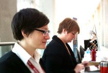
Laura and Martha
UxWG conference
Laura and Martha
UxWG conference
Laura and Martha
UxWG conference
View code
<div class="span-3">
	<div class="module-poster">
        <img src="images/poster.jpg" alt="Laura and Martha - UxWG conference" />
        <div class="image-caption">
            <h4>Laura and Martha</h4>
            <p>UxWG conference</p>
        </div>
    </div>
</div>
Layer this module with other CSS to achieve new effects
View code
<div class="span-2">
	<div class="module-poster">
	<a href="#">
        <img src="images/poster.jpg" alt="Laura and Martha - UxWG conference" />
        <p class="position-top-medium position-left background-dark">
            Link text goes here
        </p>
	</a>
    </div>
</div>
module-contact style
Use the module-contact to feature basic contact information (complex information should use a regular table instead of this CSS module).
613-222-1111
Acting Program Director
613-222-2222
Administrative Assistant
613-222-3333
Officer
613-222-4444
Officer
View code
<div class="span-6 module-contact">
  <div class="span-2 row-start">
    	<p><a href="mailto:">Susan-Lynn McFakename</a></p>
    </div>
    <div class="span-2">
    	<p>613-222-1111</p>
    </div>
    <div class="span-2 row-end">
    	<p>Acting Program Director</p>
    </div>
    <div class="clear"></div>
    <div class="span-2 row-start">
    	<p><a href="mailto:">Peter Notarealname</a></p>
    </div>
    <div class="span-2">
    	<p>613-222-2222</p>
    </div>
    <div class="span-2 row-end">
   		<p>Administrative Assistant</p>
    </div>
    <div class="clear"></div>
</div>
<div class="clear"></div>
module-news and module-spotlight style
Use the module-news and module-spotlight classes for news articles and stories. The module-news class allows you to embed an article or story. It works in conjunction with the module-news-article class. The module-spotlight showcases a list of links to articles or stories.
module-spotlight
Heading
 Link text
View code
<div class="span-2 row-start module-spotlight">
<h3>Heading</h3>
<ul>
<li><a href="#news"><img src="images/placeholder.gif" alt="" width="100" height="62" />Link text</a> <p>Some non-link text</p></li>
<li><a href="#news"><img src="images/placeholder.gif" alt="" width="100" height="62" />Link text</a> <p>Some non-link text</p></li>
<li><a href="#news"><img src="images/placeholder.gif" alt="" width="100" height="62" />Link text</a> <p>Some non-link text</p></li>
<li><a href="#news"><img src="images/placeholder.gif" alt="" width="100" height="62" />Link text</a> <p>Some non-link text</p></li>
</ul>
</div>
<div class="span-3 row-end module-spotlight">
<h3>Heading</h3>
<ul>
<li><a href="#news"><img src="images/placeholder.gif" alt="" width="100" height="62" />Link text</a> <p>Some non-link text</p></li>
<li><a href="#news"><img src="images/placeholder.gif" alt="" width="100" height="62" />Link text</a> <p>Some non-link text</p></li>
<li><a href="#news"><img src="images/placeholder.gif" alt="" width="100" height="62" />Link text</a> <p>Some non-link text</p></li>
<li><a href="#news"><img src="images/placeholder.gif" alt="" width="100" height="62" />Link text</a> <p>Some non-link text</p></li>
</ul>
</div>
module-news and module-news-article
Wenim vitae molestie rutrum!

Fusce quis augue tortor. Aenean aliquet, enim vitae molestie rutrum, ligula est egestas eros, vel ullamcorper nulla sem sed tortor. Proin sollicitudin blandit turpis et faucibus.
Quisque blandit, leo non
Integer condimentum faucibus bibendum. Integer tempus urna ut nulla pellentesque vulputate.
View code
<div class="span-2 module-news">
<h3 class="margin-bottom-medium"><a href="#news">Wenim vitae molestie rutrum!</a></h3>
<div class="module-news-article"> <img src="images/placeholder3.gif" alt="" width="198" height="122" />
    <p>Fusce quis augue tortor. Aenean aliquet, enim vitae molestie rutrum, ligula est egestas eros, vel ullamcorper nulla sem sed tortor. Proin sollicitudin blandit turpis et faucibus.</p>
    <p><a href="#news" class="button button-accent">Continue reading</a>
    <a href="#news" class="button button-none">34 Comments</a></p>
</div>
</div>
<div class="span-3 module-news">
<h3 class="margin-bottom-medium"><a href="#news">Quisque blandit, leo non tempus</a></h3>
<div class="module-news-article"><img src="images/placeholder3.gif" alt="" width="198" height="122" />
    <p>Integer condimentum faucibus bibendum. Integer tempus urna ut nulla pellentesque vulputate. </p>
    <p><a href="#news" class="button button-accent">Continue reading</a></p>
</div>
</div>
<div class="clear"></div>
module-comment style
Use the module-comment and wet-boew-zebra classes to style user's comments and responses.
View code
<div class="span-5 module-comment">
    <p class="background-dark">3 Comments</p>
    <ol class="wet-boew-zebra">
        <li>
        <div>Jessica</div>
        <div>November 19, 2009</div>
        This is placeholder text. This is placeholder text. This is placeholder text. This is placeholder text. This is placeholder text. This is placeholder text. This is placeholder text.</li>
        <li>
        <div>Mihn</div>
        <div>November 19, 2009</div>
        This is placeholder text. This is placeholder text. This is placeholder text. This is placeholder text. This is placeholder text. This is placeholder text. This is placeholder text. blah blah blah blah blah blah blah blah blah blah blah blah blah blah blah blah blah blah blah blah blah</li>
        <li>
        <div>Eddie</div>
        <div>November 19, 2009</div>
        This is placeholder text. This is placeholder text. This is placeholder text. This is placeholder text. This is placeholder text. This is placeholder text. This is placeholder text.</li>
    </ol>
</div>
- Date modified:
3 Comments