Images réactives
Needs translation
Table of contents
Features
This plugin emulates the proposed HTML5 <picture> element. It allows multiple sizes of an image to be specified that target different screen resolutions and devices.
CSS media queries are used to determine which image is displayed. As a result the plugin only works in modern browers that support CSS media queries. Browsers that don't support media queries display the image from the <div [data-src]> element with no data-media attribute set.
Usage
Add the wet-boew-responsiveimg CSS class to any element on your page. This will trigger the plugin, which in turn uses the Picturefill library to create the responsive image(s).
Markup
The following creates a single responsive image using a min-width media query:
<div data-picture="data-picture" data-alt="Alt text" class="wet-boew-responsiveimg">
   <!-- Default image: <div [data-src]> with no data-media
        attribute is displayed when:
        1. None of the other <div [data-src]> media queries match.
        2. The browser doesn't support media queries  -->
   <div data-src="large.jpg"></div>

   <!-- Images for browsers with CSS media query support -->
   <div data-src="small.jpg" data-media="(min-width: 0px)"></div>
   <div data-src="medium.jpg" data-media="(min-width: 500px)"></div>
   <div data-src="large.jpg" data-media="(min-width: 960px)"></div>
   <div data-src="extralarge.jpg" data-media="(min-width: 1200px)"></div>

   <!-- Fallback content for non-JS browsers. -->
   <noscript><img src="large.jpg" alt="Alt text"></noscript>
</div>
| Attribute | Purpose |
|---|---|
data-picture |
Identifies the <div> as a responsive image. |
data-alt |
Alternate text that will be used for the image's alt attribute. |
data-src |
Path to the image. |
data-media |
CSS media query that determines when the image source is used. If not specified, this is the default image to display for browsers that don't support CSS media queries. |
Examples
Browser Width
This example uses min-width to determine which image should be displayed. Resize the browser window to see the different images load.
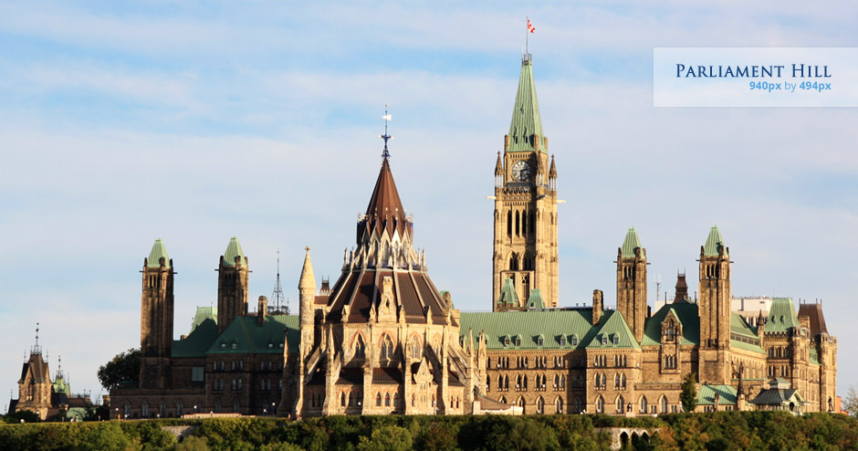
Photo by Noema Pérez, licensed under Creative Commons.
View code
<div  data-picture="data-picture" data-alt="Parliament Hill" class="wet-boew-responsiveimg">
   <!-- Default image: <div [data-src]> with no data-media attribute is displayed when:
           1. None of the other <div [data-src]> media queries match.
           2. The browser doesn't support media queries  -->
   <div data-src="images/parliament-hill-large.jpg"></div>

   <!-- Images for browsers with CSS media query support -->
   <div data-src="images/parliament-hill-small.jpg" data-media="(min-width: 0px)"></div>
   <div data-src="images/parliament-hill-medium.jpg" data-media="(min-width: 500px)"></div>
   <div data-src="images/parliament-hill-large.jpg" data-media="(min-width: 960px)"></div>
   <div data-src="images/parliament-hill-extralarge.jpg" data-media="(min-width: 1200px)"></div>

   <!-- Fallback content for non-JS browsers. -->
   <noscript><img src="images/parliament-hill-large.jpg" alt="Parliament Hill"/></noscript>
</div>
High Pixel Density
This example uses two media queries to serve high resolution images to devices that will benefit from them (i.e. Retina displays).
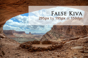
Photo by snowpeak, licensed under Creative Commons.
View code
<div  data-picture="data-picture" data-alt="False Kiva in the Canyonlands">
   <!-- Images for different device resolutions -->
   <div data-src="images/cave-low-res.jpg"></div>
   <div data-src="images/cave-high-res.jpg" data-media="(-webkit-min-device-pixel-ratio: 2),(min-resolution: 192dpi)"></div>

   <!-- Fallback content for non-JS browsers -->
   <noscript><img src="images/cave-low-res.jpg" alt="False Kiva in the Canyonlands"/></noscript>
</div>
- Date de modification :