2020-37 - Review of improved Service initiation template
- Expert: @duboisp
- Status: Draft
- Last updated: 2020-06-30
- History:
- 2020-12-07 - @duboisp - Reformating and added screen reader test
- 2020-06-30 - @GormFrank - First draft
On this page and related links
- Github discussion - GCWeb #1627
- Quick test with adaptive technology for double H1’s - 2020-02-27
- Web Accessibility Working Group first review - 2020-01-07
- Early comments, first perception - 2020-11-12
- References
- 2020-40 - Evaluate the accessibility conformity of the Canada child benefit introduction page of Canada.ca assessment completed on January 2020
- 2020-34 - Evaluate the accessibility conformity of the Canada child benefit apply page of Canada.ca assessment completed on January 2020
Quick test with adaptive technology for double H1’s
From: WAWG - February 27, 2020
- Completed by: 1 person that use adaptive technology everyday.
- Question: Do you find the use of two primary headings (H1) obfuscates the purpose of the page or makes it less clear?
- Answer: No, clarity was fine. I went back and had another look with that in mind, but as I said no problem.
- Context: The person tested with a page that was containing generic latin text. The latin containing text was mostly more confusing compared to the use of double h1.
Early comments, first perception
From: @duboisp - November 12, 2019
- I like the overall visual look. (Bullet item 1)
- I worry about the use of two heading level 1. (Bullet item 2)
- I know that HTML5 (the specification) support that pattern, but as far that I know browser still don’t support it or badly support it. (Bullet item 3)
- We need to keep in mind that we still need to support IE11. At my last check, last summer, IE11 represented more than 15% of all the traffic on Canada.ca (Bullet item 4)
- I understand the need of identifying uniformly a set of pages that belong to the same task. I think we should explore alternative markup that would create the same visual effect for desktop and mobile. (Bullet item 5)
- I have a few idea and I think they will need to be prototyped too (Bullet item 6)
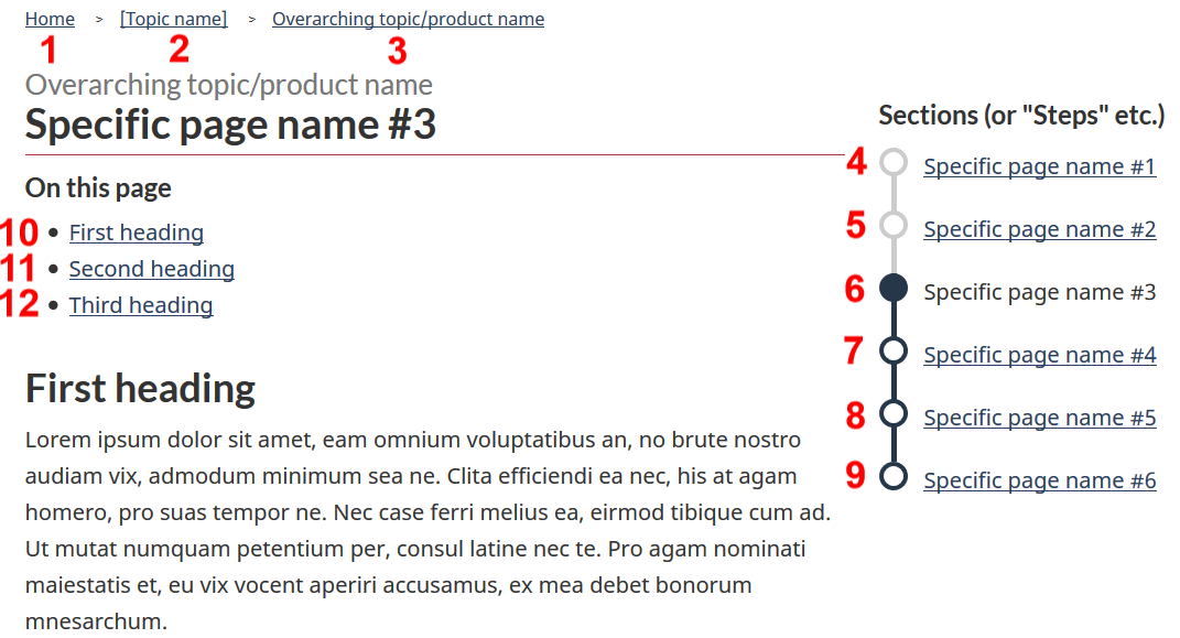
- Instead of starting with an h1, we could start with an h2 (“Overarching topic”) followed by an h3 for the enumeration of section (“Steps”) and then have the h1 (“Specific page name”). (Bullet item 7)
- Use a paragraph for “Overarching topic” then an h2 for “Steps” and then the h1 (“Specific page name”). (Bullet item 8)
- Include screen reader only text in the h1 (“Specific page name”) that is the “Overarching topic”. (Bullet item 9)
- Some aria-label was added, but I am unsure if it is actually needed as the main content, in this context there will only be 1 navigation section in the main element. (Bullet item 10)
- I am suggesting to remove the aria-label (Bullet item 11)
- The navigation link (Steps_ are missing some semantic regarding which one are past, current and future steps. There is a visual indicator but it is not supported yet by semantic or content. This actually fail SC 1.4.1. To provide that contextual information I am suggesting to: (Bullet item 12)
- Add some screen-reader only text, or (Bullet item 13)
- Use some special wai-aria 1.1 state (Bullet item 14)
- The alert component example will be better if it was wrapped inside a section element. (Bullet item 15)
- There will be some documentation material to produce that would describe how to use it and the meaning of new CSS class like: gc-navseq and gc-nav-section (Bullet item 16)
- I know that TBS –DTO currently work on a documentation template, but I would need technical documentation similar to the service and information component here: https://wet-boew.github.io/themes-dist/GCWeb/component/gc-srvinfo.html (Bullet item 17)
Evaluation by Accessibility, Accommodations & Adaptative Computer Technology (AAACT) Program
From: Accessibility, Accommodations & Adaptative Computer Technology (AAACT) Program - January 7, 2020
Comments about the points raised.
Bullet item 1
I like the overall visual look
(comment made by duboisp on November 12, 2020)
Strongly agreed.
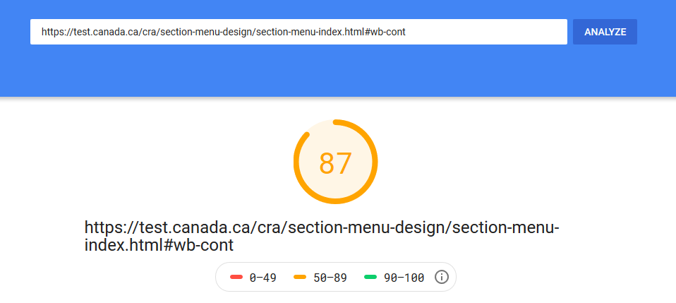
Especially its image-free/bannerless layout made more sense to me. When a user needs to learn something, decorative images or rotating banners about various topics do nothing but slow the load time. They may be distracting as well.
Here is the speed test result by Google PageSpeed Insights for the first hyperlink. Page loads quickly.
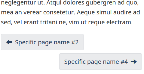
The responsive design works perfectly as well. (I particularly liked how the left and right arrows are located on smaller screens: left arrow on the left and right arrow on the right.)
Bullet item 2
I worry about the use of two heading level 1.
(comment made by duboisp on November 12, 2020)
(PASS)
Bullet item 3
I know that HTML5 (the specification) support that pattern, but as far that I know browser still don’t support it or badly support it.
(comment made by duboisp on November 12, 2020)
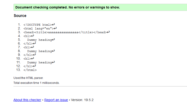
I researched this before. Apart from some best practice recommendations, I have no evidence to suggest that only one h1 should be used on the same page.
This passes the html validation checker:
An official guidance about headings mentions the correct nesting practices and recommends to avoid skipping levels, but there is no mention of the necessity of one single h1 in one page.
| [Accessibility concerns | Mozilla](https://developer.mozilla.org/en-US/docs/Web/HTML/Element/Heading_Elements#Accessibility_concerns) |
From Mozilla:
“A common navigation technique for users of screen reading software is jumping from heading to heading to quickly determine the content of the page. Because of this, it is important to not skip one or more heading levels. Doing so may create confusion, as the person navigating this way may be left wondering where the missing heading is.”
Don’t
		<h1>Heading level 1</h1>
		<h3>Heading level 3</h3>
		<h4>Heading level 4</h4>
Do
		<h1>Heading level 1</h1>
		<h2>Heading level 2</h2>
		<h3>Heading level 3</h3>
Bullet item 4
We need to keep in mind that we still need to support IE11. At my last check, last summer, IE11 represented more than 15% of all the traffic on Canada.ca
(comment made by duboisp on November 12, 2020)
There seems to be no IE-related issues. I tested using IE11’s emulation tool and even IE6 seems to show everything almost the same, thanks to this css file: https://www.canada.ca/etc/designs/canada/wet-boew/css/ie8-theme.min.css
Of course, a real IE6 browser might show otherwise, but I guess designing for anything less than IE9 is unnecessary.
Bullet item 5
I understand the need of identifying uniformly a set of pages that belong to the same task. I think we should explore alternative markup that would create the same visual effect for desktop and mobile
(comment made by duboisp on November 12, 2020)
Bullet item 6
I have a few idea and I think they will need to be prototyped too
(comment made by duboisp on November 12, 2020)
Bullet item 7
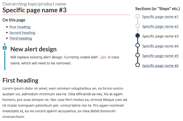
Instead of starting with an h1, we could start with an h2 (“Overarching topic”) followed by an h3 for the enumeration of section (“Steps”) and then have the h1 (“Specific page name”)
(comment made by duboisp on November 12, 2020)
(FAIL LEVEL A 1.3.1)
https://www.hhs.gov/web/section-508/making-files-accessible/html-required/index.html#_headings
Bullet item 8
Use a paragraph for “Overarching topic” then an h2 for “Steps” and then the h1 (“Specific page name”)
(comment made by duboisp on November 12, 2020)
The 2 ideas above are about using h1s later in the page. Although I could not find anything concrete against this usage, it will certainly create a tricky layout. Nesting the sections is the key here and I am afraid it will be prone to errors. Not starting with an h1 will puzzle both publishers and users.
From https://webdesign.tutsplus.com/articles/the-truth-about-multiple-h1-tags-in-the-html5-era–webdesign-16824
There should always be a ”h1” level heading between the opening ”body” tag and the first content section, to label the overall document.
Bullet item 9
Include screen reader only text in the h1 (“Specific page name”) that is the “Overarching topic”.
(comment made by duboisp on November 12, 2020)
This will create a page without an h1 for the sighted users. Since the screen readers are supposed to read what the sighted users see, not some hidden information. I am not sure whether it will help.
An article about h1s from the University of Illinois
I cannot see what is wrong with the current heading structure. Perhaps we can discuss this altogether.
Bullet item 10 and 11
Some aria-label was added, but I am unsure if it is actually needed as the main content, in this context there will only be 1 navigation section in the “main” element
I am suggesting to remove the aria-label
(comment made by duboisp on November 12, 2020)
ARIA usage is a tricky subject matter.
If this code is what you are talking about
<nav aria-label="Section menu">
w3.org says:
“For most assistive technology it’s fine to use aria-label or aria-labelledby on the nav, and main elements but not on footer, section, article, or header”
I think the ARIA usage is not incorrect in this case.
A very relevant example is available at mozilla.org Here is what they say:
Content from Mozilla:
Repeated landmarks: If a navigation landmark role or ”nav” element in a document is repeated in a document, and both landmarks have identical content, use the same label for each landmark. An example of this would be repeating the main navigation at the top and bottom of the page.
		<header>
		  <nav id="main-nav" aria-label="Main">
			<!-- list of links to main website locations -->
		  </nav>
		</header>
		...
		<footer>
		  <nav id="footer-nav" aria-label="Main">
			<!-- list of links to main website locations -->
		  </nav>
		</footer>
Redundant descriptions: Screen readers will announce the type of role the landmark has. Because of this, you do not need to describe what the landmark is, in its label. For example, a declaration of role=”navigation” with an aria-label=”Primary navigation” may be announced redundantly as, “primary navigation navigation”.
In general, you are absolutely right, the existing aria-labels should be reconsidered one-by-one and those that are unnecessary should be removed. The list below is from w3.org/TR/using-aria:
- Don’t use aria-label or aria-labelledby on any heading elements because it overrides them on NVDA, VoiceOver and Talkback. JAWS ignores them.
- Don’t use aria-label or aria-labelledby on any other non-interactive content such as p, legend, li, or ul, because it is ignored.
- Don’t use aria-label or aria-labelledby on a span or div unless its given a role. When aria-label or aria-labelledby are on interactive roles (such as a link or button) or an img role, they override the contents of the div or span. Other roles besides Landmarks (discussed above) are ignored.
Consequently, these 3 ARIA codes should be removed from https://test.canada.ca/cra/section-menu-design/section-menu-pg3.html#h_2:
		<button type="button" aria-haspopup="true" aria-expanded="false">
			<ul role="menu" aria-orientation="vertical">
The overreliance on ARIA causes many failures on many accessibility criteria, due to incorrect usages.
Bullet item 12, 13 and 14
The navigation link (Steps_ are missing some semantic regarding which one are past, current and future steps. There is a visual indicator but it is not supported yet by semantic or content. This actually fail SC 1.4.1.
(comment made by duboisp on November 12, 2020)
To provide that contextual information, @duboisp is suggesting to:
- Add some screen-reader only text, or
- Use some special wai-aria 1.1 state
There should be better solutions we can discuss. A low-tech solution might be adding tooltips for each step.
Bullet item 15
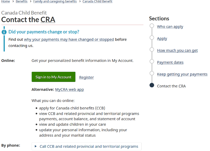
The alert component example will be better if it was wrapped inside a “section” element
(comment made by duboisp on November 12, 2020)
You are absolutely right.
Alerts should be separate sections, cannot be just presented inside divs. If they are to be redesigned, they should be inside their own sections, as before.
This is the old mark-up I guess.
		<section class="alert alert-info">
		  <h3>Did your payments change or stop?</h3>
		  <p>Find out <a href="./keep-getting-payments.html#stop">why your payments may have changed or stopped</a> before contacting us.</p>
		</section>
However, the new design might have other drawbacks. Consider that the alert is located like this:
Then it becomes messy. Where does the alert begin and where does it end? I also see a jungle of headings.
I personally don’t think removing the background improves anything.
Bullet item 16 and 17
There will be some documentation material to produce that would describe how to use it and the meaning of new CSS class like: gc-navseq and gc-nav-section
I know that TBS –DTO currently work on a documentation template, but I would need technical documentation similar to the service and information component here: https://wet-boew.github.io/themes-dist/GCWeb/component/gc-srvinfo.html
(comment made by duboisp on November 12, 2020)
Additional issues, from WAWG
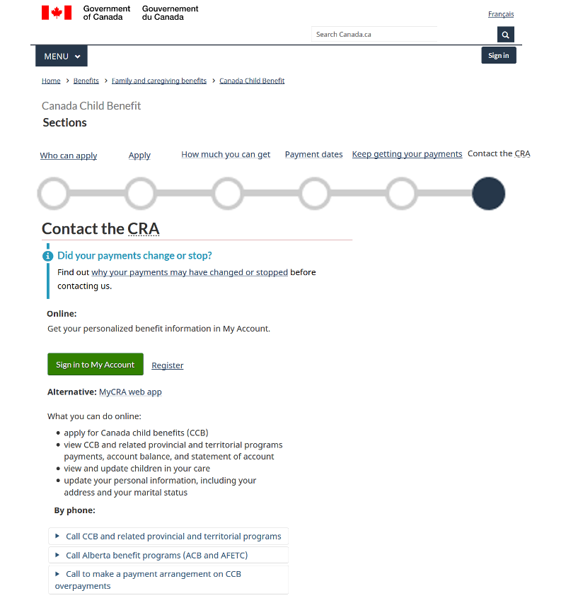
Issue A - reading sequence
The “correct reading sequence” is considered as reading from left to right and top to bottom. When there are 2 columns, the first column is read first and the second begins after the first ends.
The existing focus order is marked with red numbers.
(FAIL Level A. 1.3.1, 1.3.2, and 2.4.3 criteria.)
Issue B - confusing layout
Accessibility concerns aside, to my opinion, this layout is somehow confusing even for the perfectly sighted people. It is difficult to understand which content is under which heading or how many topics there are.
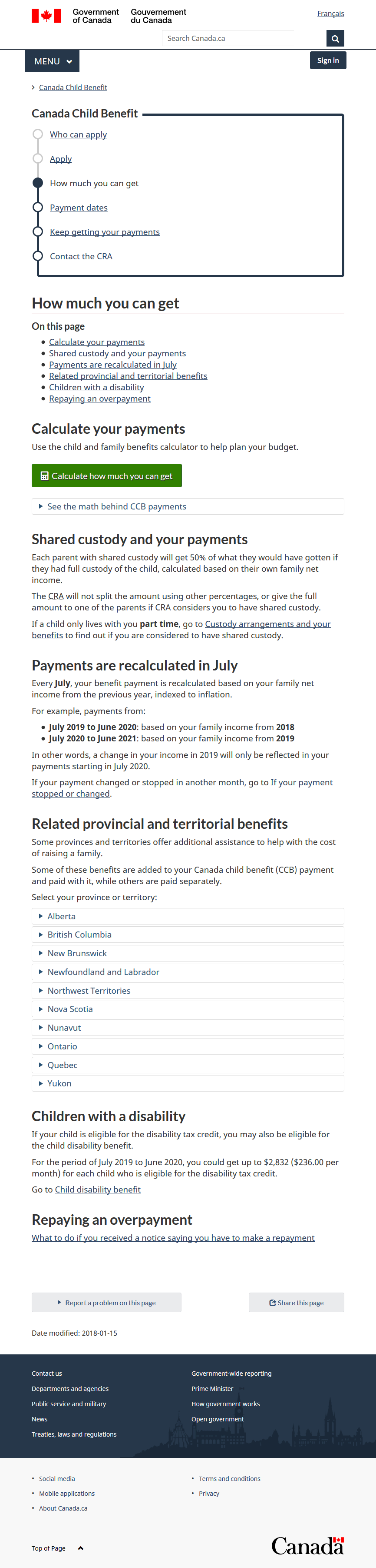
The page: https://test.canada.ca/canada-child-benefit-2/post-validation/revenue-agency/services/child-family-benefits/canada-child-benefit/contact.html#contact
The solution suggested, from WAWG
(please see the very rough mock-up below)
To keep correct tab order in harmony with what is visible, the side navigation “Sections” on the right could have been made horizontal and inserted between “Canada Child Benefit” and “Contact the CRA” headings.
Like form labels and inputs, the sentences could have been simply positioned on top of each other.
No mark-up can be used inside the title element. I know for a fact that there are publishers being too creative about titles.
<title>Contact the <abbr title="Canada Revenue Agency">CRA</abbr> - Canada Child Benefit - Canada.ca</title>
This is how it looks on hover:

There are many validation errors, including several stray tags, duplicate IDs. (FAIL 4.1.1 PARSING LEVEL A)
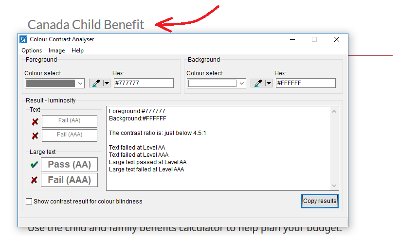
Grey headings fail the contrast checker test. (FAIL 1.4.3 CONTRAST LEVEL AA)
Its text size is 1.3em, corresponding to 15pt. It is not considered as large text. Here are the WCAG Sufficient Techniques:
Situation A: text is less than 18 point if not bold and less than 14 point if bold
- G18: Ensuring that a contrast ratio of at least 4.5:1 exists between text (and images of text) and background behind the text
- G148: Not specifying background color, not specifying text color, and not using technology features that change those defaults
- G174: Providing a control with a sufficient contrast ratio that allows users to switch to a presentation that uses sufficient contrast
- SL13: Providing A Style Switcher To Switch To High Contrast (Silverlight)
I think the medium-size screen shows the most linear layout:
References
- https://test.canada.ca/cra/section-menu-design/section-menu-index.html (unavailable)
- https://test.canada.ca/cra/section-menu-design/section-menu-pg3.html (unavailable)
- https://test.canada.ca/canada-child-benefit-2/post-validation/revenue-agency/services/child-family-benefits/canada-child-benefit.html
- https://test.canada.ca/canada-child-benefit-2/post-validation/revenue-agency/services/child-family-benefits/canada-child-benefit/apply.html