UX research 2018-1 - Filtering interface with performance meter
Subject: There is a list of results, block of content, that are measured by category and filterable by clicking on the meter or/and by clicking on buttons to apply filter by another category.
Test information
- Number of participant: 8 paticipants [6 desktop, 1 mobile (Windows surface)]
- Participant diversity: Public servant with varying levels of experience with governement
- Tested period: October 28 and October 27, 2017
- Used in public period: January 2018 to March 2018
- Other remark:
- Usability test round 1 result.
- Test as during approximately 20 minutes per participant.
- Test subjects kept trying when “real” users would give up
Wireframe tested
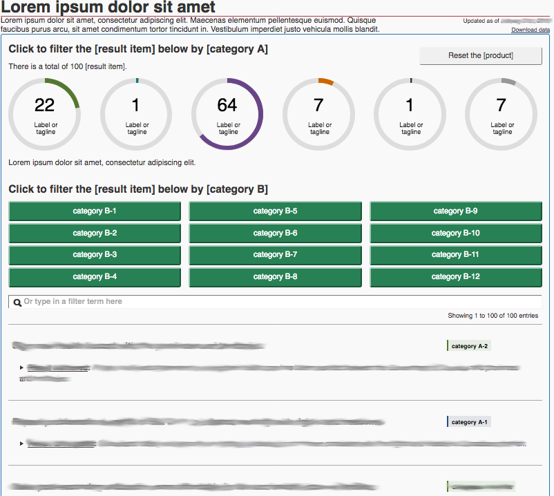
Desktop view:
Mobile view image:
Technical implementation notes
The results, as showed in the bottom of the screen capture, was showing more information when the user click on the expand/collapsae link illustrated with the arrow.
The data was loaded from an external JSON file.
Each meter for the category A was also a link to apply filter.
Between the displayed result and the filtering options, there is a tag cloud allowing to remove a previously applied filter.
Task results
- Filtering by [category A] was the common way people looked for things - when [category A] are ambiguous this is likely to fail.
- People don’t know they’re on a filter - searches will fail
- Throughout the test, only 3 clearly understood how to reset the filters (1 mobiles, 1 by refreshing page, 1 by clicking X filters)
- Filtering by [category A] works well, and the related statuses are clear in dektop and mobile… As long as the subject fits into one [category B]
- Ambiguous [category B] are a problem
- [Category B] banner probably looks like an add (banner blindness)
- [Category A] label are successful
- It’s hard to pick relevant information out of these description (result item description)
List of recommendation
- Either:
- make it more clear that searches are limited by filters; or
- make it so searches span the entire set
- Filtering must be clearer
- Better labels - for [category A]
- Clearer filter reset
- Clearer text describing the result items, heading, bullets, paragraphs etc.
- Reconsider design of [Category B] banner
- Result item should explain why they have the [category A] they do
- Rewrite the result items content using web writing principles
Findings
Filters don’t appear to affect display
- Good: People did clearly understand that the [category A] numbers reflected number of result items in a clicked [category B]
- Critical: No indication that changes here affect the displayed result items. Some people figured it out, but it took time.
- Recommendation: Ensure that there’s some way for people to know the result items displayed have changed.
Whath out for false floors!
Context: Desktop view with a descriptive box of [category B] between [category B] and result items
- Major: When the bottom of teh screen look like the bottom of a page, people don’t know there’s more bellow. Everyone eventually went bellow, but best to avoid this friction when possible.
- Recommendation: Revise design to ensure continued text appears on typical screen sizes.
Search isn’t apparent
- Major: Search would have been the best way to solve many task. Only 4 people used the search box.
- Recommentation: Make search more apparent
Issue found
- Critical: Everyone tried to use the [category B] buttons to finds a result item - often guessing wrong. The [category B] are very appealing as a filter but they don’t function well.
- Recommendation: Use more standard filtering controls
Reset filters
- Critical: Only 1 person clicked the close button in the tag cloud. 1 figured out page refresh reset. If this isn’t apparent, people will miss [result item], not understant [category A].
- Recommendation: Revise the [category B] filtering mechanism to use commonly understood functionality
Hard to pick out relevant information
- Critical: Wall-of-test style display makes it hard to pick out points (and goes against Canada.ca Content Style Guide)
-
Recommendation: Revise the description of the result itme by using web writing principles. Separate sections for Why.
- Minor: Link to “learn more” at the end of a result item seemed out of place
- Recommendation: Find another way to link to more information aobut [category B]
Information hidden behind details/summary
- Critical: Some users navigate with find in page (ctrl+f). They will not find information hidden behing details/summary
- Recommendation: Remove the details/summary
Filter [category A] flags were very successful
Results layout - simpler?
- Recommendation: Consider simpler default layout - maybe just title? Or maybe display everything? Remove “Learn more link…” Various design possiblities.
Layout issue - smaller screens or bigger fonts.
The [category B] that span on multiple row and kept in 3 column do not reflow well when the items in the columns are not in the same height.
The effect is:
- We got a button that is split between column 1 and column 2
- There is a white space at the bottom of the third columns
Mobile layout - pretty clean
Other issue (but not found in usability test)
Several Style guide issues
- [result item] and [category B] title shouldn’t be in title case.
- “Click to view” - many people cannot click (mobile and assistive technology)
- “Result anticipated” followed by a line of text, which when clicked reveals more details - non-standard use of this pattern which is unpredictable
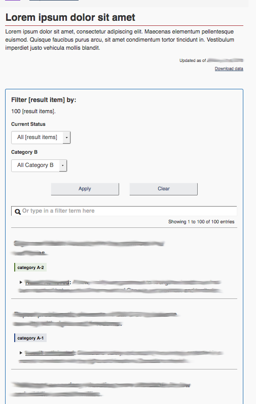
Proposed improved wireframe
- Remove the button for applying the filter for the Category B
- Put in the left side of the result, a filter didicated section.
- Keep only one coded user interface for mobile view and desktop view
- Move the free text filter, in the top of filter area instead of just before the results.
Visual of the improved layout

Notes:
- Used in production since March 2018
That new layout has been used like that since March 2018, (consider today as end of June 2018) and we received a lot of positive feedback. The subject matter expert that sponser the content with that layout seems to be happy with the design and with it’s effiviency for their audience.