1 - Datalist JSON suggestion - Research and finding - Web Experience Toolkit (WET) documentation
Purpose
Customizable autocomplete feature.
Requirements
- Load suggestion / autofill value:
- From HTML source
- From CSV documents
- From JSON documents
- Limit number of displayed items
- Allow customization of the suggested items.
- Follow design pattern of a datalist for accessiblity.
- Have uniform and consistant behavior from various browser. Like IE11, Chrome, Firefox, Edge
- Support grouping of items, like
<optgroup>do for<select> - Be able to configure where the filtering is applied: startWith, word, any
- Be able to configure how the filtering is applied: Exact Match, SoundEx, Levenshtein distance.
- Be able to highlight the typed character found within the displayed result. Like putting it in bold so the user can easilly make the liaison between the typed character and the suggested results.
- Having a persistant results, like an “others” options.
Early prototype
- 2018-04-08 - combobox prototype
- 2018-04-11 - combobox prototype 2 - Async loading
- 2018-04-13 - combobox prototype 3 - Validation and form integration
- 2018-04-16 - combobox prototype 4 - Allow free text input (datalist)
- 2018-04-16 - combobox prototype 5 - Limiting number of result and type of filter
- 2018-04-18 - combobox prototype 6 - Fieldflow integration and down arrow
- 2018-05-09 - combobox prototype 7 - By using a reactive template engine
- 2018-05-16 - combobox prototype 8 - Fieldflow integration with default action if no match found by using a reactive template engine
- 2018-05-16 - combobox prototype 9 - Fieldflow and async load (Might not work)
- 2018-05-28 - combobox prototype 10 - Fieldflow and default and async load - With reactive engine
- 2018-06-21 - Template playground prototype - Render UI by using the combobox templating system
UX feedback from early prototype
Others
- 2018-06-21 - Template playground prototype - Render UI by using the combobox templating system
- 2018-06-21 - Combobox documentation for WET plugin - Draft in handlebar (.hbs)
Remarks
Terminology issue: There is a confusion about the right terminology to properly name this features. Some call it auto-complete, other call it datalist and other call it combobox.
Here the definition we will now use forward. It’s based on how it is descrbied in W3C ARIA specification.
- Autocomplete: The autocomple is a mode of the combobox where it will pre-fill the input based on suggested options. ref. Combobox WAI ARIA Practices 1.1
- Datalist: It’s one of the multiple type of popup for a combobox. “Datalist” term is defined and introduced by the HTML5 spec. It’s equivalent is the
listboxrole as defined per WAI Aria spec. ref. Combobox WAI ARIA Practices 1.1; ref. The datalist element, HTML 5.3 - Combobox: A Combobox is a combinaison of two element, an input box and a popup. It is use to suggest a list of options at the user and usually the user can navigate through the information inside the popup in order to choose the right one. A combobox can have a popup that is: a listbox, a grid, a tree or a dialog. ref. Combobox WAI ARIA Practices 1.1
All this research documents, as May 28 - 2018, is about the “combobox functionality”, the initial version only support listbox and don’t support autocomplete feature.
Similar tools
Here a list of similar tools that was found on a February 2018 research
- jQuery accessible autocomplete list (with some ARIA)
- mfranzke - datalist-polyfill
- JSFiddle - https://jsfiddle.net/mfranzke/s6awjfze/
- Github - https://github.com/mfranzke/datalist-polyfill
- Accessible autocomplete
- SelectWoo Accessibility Testing Samples
- Chosen
- Web Search Engine with Autocorrect and Autofill feature
- A mashup of server side and client side. Not very re-usable for the need here.
- Android Autofill Framework
- Android specific application. Not very re-usable for the need here.
- React autosuggest
- Datalist JSON suggestion
- (Added on May 28, suggested on May 23) github/auto-complete-element
Similar tools added on August 6th 2018
Similar tools added on December 2nd 2020
- Alphagov (UK) - Accessible-autocomple (Other example) - Github Source Code
- Webaxe - Accessible custom select dropdown
Website using custom datalist
- http://wet-boew.github.io/themes-dist/GCWeb/demos/suggest/suggest-en.html
- http://www.btb.termiumplus.gc.ca/tpv2alpha/alpha-fra.html?lang=fra - Reverse engenering suggestion for when typing in the field “Terme à cherche”
- https://www.momondo.ca/?redirect=true
- Try to choose a flight, the dropdown item are customized
- National Help Desk: http://srmis-sigdi-iagent.prv
Feature request description
last review: April 6, 2018
- The autofill needs to have a text field where users can type, and the options related to what they typed appear below.
- The autofill should have the option “filter as you type”
- Filter as you type: Will populate a list of relevant task containing the characters in series as user types; the list updates for each new character added
- As the user types, it does not need to be the first word in the task it can be any word within the task that will pick up the options.
- When the user is typing they should not see the entire task list that consists of up to 200 tasks
- Users must select one of the items from the options, they cannot type whatever they want and submit.
- There needs to be an “other” option accompanying the tasks at all time, so that if the tasks don’t apply to that user, they have an option to select something.
- The autofill needs to pull the data from the excel spreadsheet that we provide.
- The autofill should allow for the number of tasks to be unlimited so that when we add new tasks in the future it will be some form of a data dump.
- When an option is not available in the list, upon submission, redirect the user to a page where it would be able to submit the new items.
- When an option is not available in the list, let use what the user typed as the value.
- Limit number of displayed items.
- Load suggestion from a JSON dataset.
- Specify what kind of filtering, first matching character in the suggestions, first character of a word, any character.
- Load suggestion from an array of string in a JSON file
- Be able to limit the number of displayed suggestion
- Be able to change the filtering behaviour like Any, StartWith, Word
- Be able to use a pattern match with would match suggestion that are 80% closer to what the user typed in. This is to accommodates even if there some typos in the inputs. Like: Soundex, Levenshtein distance
Feature that might worth to considerate
- Should we allow the suggested options to be grouped? Like what the
optgroupelement do with theselectelement.
Resources
- The
listattribute - HTML 5.3 W3C Working Draft - contains information when used in combination withmultipleattribute. - The
datalistelement - HTML 5.3 W3C Working Draft - The
datalistelement - HTML living standard multipleattribute - HTML living standard - Contains a visual example of a customized datalist- ARIA default role: listbox
- Developing a Keyboad Interface - WAI ARIA practices
- Listbox - WAI ARIA practices
- Scrollable listbox example - WAI ARIA practices
- Collapsible Dropdown Listbox Example - WAI ARIA practice
- Example Listbox with Reaarangeable Options - WAI ARIA practice
- Grids: Interactive Tabular Data and Layout Container - WAI ARIA practice
- Example 3: Scrollable Search Results - WAI ARIA practice
combobox(role)aria-autocomplete(property)
Quote from spec
To be keyboard accessible, authors SHOULD manage focus of descendants for all instances of this role, as described in Managing Focus.
Source: listbox (role) - WAI ARIA 1.1
the interaction model conveyed by the listbox role to assistive technologies does not support interacting with elements inside of an option. Because of these traits of the listbox widget, it does not provide an accessible way to present a list of interactive elements, such as links, buttons, or checkboxes. To present a list of interactive elements, see the grid pattern.
Source: Listbox - WAI ARIA practices
A composite widget containing a single-line textbox and another element, such as a listbox or grid, that can dynamically pop up to help the user set the value of the textbox.
Source: combobox (role) - WAI ARIA 1.1
For instance, a combobox where the value of aria-autocomplete would be none is a search field that displays suggested values by listing the 5 most recently used search terms without any filtering of the list based on the user’s input.
Source: aria-autocomplete (property) - WAI ARIA 1.1
User Road Map / User story for Autofill
From: Ivan Hughes as April 16, 2018
- Step 1: User answers question ‘What was the purpose of your visit to our website today’”, The user then proceeds to the autofill box.”
- Step 2: No tasks will be shown as default for the user
- Step 3: User begins to type and autofill begins to auto-suggest tasks based on the Master Task List. On the back end the javascript would check what theme, then institution and then program. If the user types “CPP” then the user should only see tasks that are related to CPP such as “Apply for the Canada Pension Plan, “Apply for Canada Pension Plan Disability (CPP-D) Benefit”, etc.
- Step 4: User can either click enter or use mouse to pick the task that relates most to what they typed.
- Step 5: If none of the options is the one the user wants the user can then select other.
Test case
- See the design pattern information described in Listbox - WAI ARAI practices
Wireframe
Visual
Behaviour
Conditional submission:
- The proposed list of items are suggestions and choosing an item from the list is totally optional.
- If the typed suggestions are not in the list, then the submission would be redirected to a specific page that would take care of the text entered by the user
- The user need to choose an item in that list in order to submit
- An item might trigger a different action, like simply redirecting to a different page and an another item will do a standard from submission with server side processing.
Code sample
Take a look also at the working example from the WAI ARIA practices cite in the resources which have clue on how the enhanced user interface should be coded.
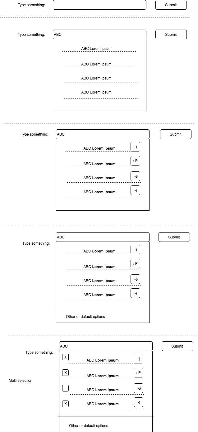
Simple datalist
<input list="datalist-id" />

<datalist id="datalist-id">
	<option>Lorem ipsum</option>
	<option>dolor sit amet</option>
	<option>consectetur</option>
	<option>adipiscing elit</option>
</datalist>
With a minimalist template, like the suggestion is loaded from a JSON files
<input list="datalist-id" />

<datalist id="datalist-id">
	<template>
		<option></option>
	</template>
</datalist>
A highly customized template where that content can’nt be holded by the datalist element. That kind of content would need to be in a overlay.
<input list="datalist-id" />

<datalist id="datalist-id">
	<template>
		<div class="row">
			<div class="col-xs-1">
				<p>:-)</p>
			</div>
			<div class="col-xs-11">
				<p></p>
			</div>
		</div>
	</template>
</datalist>
A highly customized template with fallback on standard datalist implementation
<input list="datalist-id" />

<datalist id="datalist-id">
	<template>
		<div class="row">
			<div class="col-xs-1">
				<p>:-)</p>
			</div>
			<div class="col-xs-11">
				<p></p>
			</div>
		</div>
	</template>
	<option>Lorem ipsum</option>
	<option>dolor sit amet</option>
	<option>consectetur</option>
	<option>adipiscing elit</option>
</datalist>
- Review the template as per the information and examples in the WAI ARIA practice
Fieldflow plain working example
<div class="wb-fieldflow">
	<p>Please something, something....</p>
	<ul>
		<li><a href="redirect/page-1.html">Lorem ipsum</a></li>
		<li><a href="redirect/page-2.html">dolor sit amet</a></li>
		<li><a href="redirect/page-3.html">consectetur</a></li>
		<li><a href="redirect/page-4.html">adipiscing elit</a></li>
	</ul>
</div>
Fieldflow with datalist working example
<div class="wb-fieldflow" data-wb-fieldflow='{"renderas":"datalist"}'>
	<p>Please something, something....</p>
	<ul>
		<li><a href="redirect/page-1.html">Lorem ipsum</a></li>
		<li><a href="redirect/page-2.html">dolor sit amet</a></li>
		<li><a href="redirect/page-3.html">consectetur</a></li>
		<li><a href="redirect/page-4.html">adipiscing elit</a></li>
	</ul>
</div>
- It might need an new configuration to specify a custom template
- The unordered list will be transform into option in the datalist
- By default, the user would need to choose a valid option.
- Fallback on form submission default, that might need to be a new configuration (When the typed option is not available)
- Support for multiple selection
<label for="myid">Label</label>
<select id="myid" data-wb5-enhance="autofill@autofillTemplateID">
	<option value="L">Lorem ipsum</option>
	<option value="D">dolor sit amet</option>
	<option value="C">consectetur</option>
	<option value="A">adipiscing elit</option>
</select>
<template id="autofillTemplateID">
	<div class="row" data-wb5-for="(option, index) in select.children()">
		<div class="col-xs-1">
			<p>:-)</p>
		</div>
		<div class="col-xs-11">
			<p><button data-wb5-on="click@selectOption(index)"></button></p>
		</div>
	</div>
	<button data-wb5-on="click@selectOption( select.children().length - 1 )">Default option</button>
</template>
Review of existing tools
jQuery accessible autocomplete list (with some ARIA)
Working example: jQuery accessible autocomplete list (with some ARIA) Source code: Github.com/nico3333fr/jquery-acc […] autocomplete-list-aria.js
- The UI and the interaction pattern is interesting and seems to address some of the requirement.
- It don’t support loading suggestion from a JSON file.
- The javascript code don’t seems to be optimized, there is a lot of repetitive code.
- The solution simulate the “suggestion” panel. It use only
<div>but it is enhanced with ARIArole=listboxfor the panel androle=optionfor each individual options.tabindex=-1is used on options - Pressing the down arrow when the focus are on the input don’t show the suggested list.
- Instructions, for screen reader only, are inserted just before the input field
- Info about the displayed result, for screen reader only, are inserted just before the input field. That block have the attribute
aria-live=polite - It contains an options to limits the number of displayed result.
- It contains an options used as “fall-back” but it didn’t work on the demo, and didn’t work on mouse click.
mfranzke - datalist-polyfill
Working example: JSFiddle Source code: Github.com/mfranzke/datalist-polyfill
- It’s a polyfill, it don’t work if the browser already support it.
- Main purpose, add the datalist feature in Safari and IE9-10
- Can be a good candidate to replace the existing datalist polyfill in WET
Accessible autocomplete
Working example: Accessible autocomplete Source code:
- Javascript - https://github.com/haltersweb/Accessibility/blob/gh-pages/js/autocomplete.js
-
CSS - https://github.com/haltersweb/Accessibility/blob/gh-pages/css/autocomplete.css
- When resizing, the overlay is not aligned with the input text.
- The relation between the typed letter and the displayed results seems to be disconnected. The displayed result seems to be tie to the number of typed letter.
- If the input already have an value, like “aa”, then when refocusing in the input, the suggestion is not displayed, but we can change the input value by navigating with the top and down arrow on the keyboard. Unless if the input initial value is one from the suggested options.
- Interesting use of
aria-activedescendantattribute to notify what item has been selected. - This solution seems to use a shadow DOM on the input field.
- Use of
aria-live=assertiveto notify the screen reader user. But after a second the notification message is removed from the DOM.
selectWoo and Select2
Working example:
Source code:
- Fork from woocommerce: https://github.com/woocommerce/selectWoo
-
Upstream: https://github.com/select2/select2
- Large jQuery plugin that contains ~5876 line of javascript code and ~485 line of CSS code
- One difference between Upstream and woocommerce fork is:
- The upstream identify the items as
treeitemingrouportreefor multi select and the woocommerce asoptioninlistbox - The upstream use
aria-selectedand the woocommerce usedata-selected
- The upstream identify the items as
- It use
aria-activedescendantto identify the items that is selected. - Nice visual example with multiple selection. When items are selected, the role
presentationshould not be used on the “x” span which act as a button to remove the tag. - The multi selection aria, with the label are regrouped in a span with the role
combobox - Custom layout (via templating) for the suggestion list need to be managed through javascript. See the working example for Ajax (remote data)
- SelectWoo - Keyboard navigation for multiple is not ideal, when selecting we can not use down arrow to select a second option.
- SelectWoo - Down arrow do not display the options
Chosen
Working example: Chosen is a library for making long, unwieldy select boxes more friendly. Source code: Github.com/harvesthq/chosen
- Use overlay, but the content is not enhanced with aria code.
- It’s enhance a basic select box into a interactive selection box with filtering
React autosuggest
Working example: Reach autosuggest Source code: github.com/moroshko/react-autosuggest
- We can only re-use the design pattern, not the code
- It use wai-aria role
optionandlistboxto enhance the accessibility, even for custom render. - For multiple, each group have it’s own
listbox - The user can not use the “down” arrow to simply show all the result
- Custom render, the style is only created with
span - Custom render, the image is a decorative image
- Nice interface, showing the selected option but the user can modify it through an “edit” button link and then all the option is displayed in a overlay and they user can select from a scrolable list.
Datalist JSON suggestion
Working example: Datalist JSON suggestion Source code: github.com/wet-boew/GCWeb
- Load suggestion from a JSON file
- Only provide datalist feature as it was implemented by the browser. So it can be inconsistent depending of the browser vendor.
- Can limit the number of displayed result
- There is some basic mode to filter items, like startWith, words and any. But the browser implementation has precedence. like in IE11 it’s always start with and the mode “any” or “word” are not supported.
List of modules
- Type of selection
- Single selection
- Multiple selection
- Type of input
- Free input, means the user can enter his own value. (HTML datalist element model)
- Predefined list, means the user need to choose one item in the list. (HTML select element model)
- Type of layout for suggestion
- Plain, only straight forward items, a simple string is displayed for each item. Will use the role
optionandlistbox - Grouped, use two listbox or use the role
grid - Customized layout, the suggestion should use the role
grid. Includes scenario:- Persistent option, at the bottom
- Input field to filter the suggested items
- Plain, only straight forward items, a simple string is displayed for each item. Will use the role
- Fieldflow
- Fallback for unknown items when the items is just a suggestions
- Gathering the list of suggested items. From HTML content, JSON file, CSV
- Type of filtering
- Start with
- Any
- Word
- Find items that are matching at 80% validated with different matching algorithm (SoundEx)
Behaviour
- For predefined list, it the input value don’t match the suggestion, then the input should be have a custom error
input.setCustomValidity('"' + input.value + '"' don't match one of the suggestions") - ? Use the “defaultValue” attribute to set the default value.
- Use the behaviour defined by aria 1.1 comboxbox role
- Detect if it’s a simple listbox or a grid or a dialog
Design pattern - Single selection
Basic HTML interface
Free input
<input list="datalist_id">
<datalist id="datalist_id">
	<option>Lorem</option>
	<option>ipsum</option>
	<option>dolor</option>
	<option>sit</option>
</datalist>
<div class="wb-fieldflow" data-wb-fieldflow='{"renderas":"combobox", "fallback": { [action object] } }'>
	<p>Please something, something....</p>
	<ul>
		<li><a href="redirect/page-1.html">Lorem ipsum</a></li>
		<li><a href="redirect/page-2.html">dolor sit amet</a></li>
		<li><a href="redirect/page-3.html">consectetur</a></li>
		<li><a href="redirect/page-4.html">adipiscing elit</a></li>
	</ul>
</div>
Predefined list
<select>
	<option>Lorem</option>
	<option>ipsum</option>
	<option>dolor</option>
	<option>sit</option>
</select>
<div class="wb-fieldflow" data-wb-fieldflow='{"renderas":"combobox"}'>
	<p>Please something, something....</p>
	<ul>
		<li><a href="redirect/page-1.html">Lorem ipsum</a></li>
		<li><a href="redirect/page-2.html">dolor sit amet</a></li>
		<li><a href="redirect/page-3.html">consectetur</a></li>
		<li><a href="redirect/page-4.html">adipiscing elit</a></li>
	</ul>
</div>
Enhanced interface
The interface as the same for Predefined option and Free input. The difference is the “predefined option” will log a custom error message if the input don’t match one items in list of suggested items.
<div role="combobox" aria-expanded="true" aria-owns="datalist_id" aria-haspopup="listbox">
    <input aria-autocomplete="list" aria-controls="datalist_id" aria-activedescendant="wb_auto_1">
</div>
<ul id="datalist_id" role="listbox">
    <li id="wb_auto_1" role="option">Lorem</li>
    <li id="wb_auto_2" role="option">ipsum</li>
    <li id="wb_auto_3" role="option">dolor</li>
    <li id="wb_auto_4" role="option">sit</li>
</ul>
{ hidden }
	<div class="wb-fieldflow" data-wb-fieldflow='{"renderas":"combobox", "fallback": { [action object] } }'>
		<p>Please something, something....</p>
		<ul>
			<li id="wb_auto_7"><a href="redirect/page-1.html">Lorem ipsum</a></li>
			<li id="wb_auto_8"><a href="redirect/page-2.html">dolor sit amet</a></li>
			<li id="wb_auto_9"><a href="redirect/page-3.html">consectetur</a></li>
			<li id="wb_auto_10"><a href="redirect/page-4.html">adipiscing elit</a></li>
		</ul>
	</div>
{/ hidden }

<div role="combobox" aria-expanded="true" aria-owns="wb_auto_6" aria-haspopup="listbox">
	<label for="wb_auto_5">Please something, something.... </label>
    <input id="wb_auto_5" aria-autocomplete="list" aria-controls="wb_auto_6" aria-activedescendant="wb_auto_1">
</div>
<ul id="wb_auto_6" role="listbox">
    <li role="option" data-wb-fieldflow='{"bind":"wb_auto_7","actions":[{"action":"redir","url":"redirect/page-1.html"}]}'>Lorem ipsum</li>
    <li role="option" data-wb-fieldflow='{"bind":"wb_auto_8","actions":[{"action":"redir","url":"redirect/page-2.html"}]}'>dolor sit amet</li>
    <li role="option" data-wb-fieldflow='{"bind":"wb_auto_9","actions":[{"action":"redir","url":"redirect/page-3.html"}]}'>consectetur</li>
    <li role="option" data-wb-fieldflow='{"bind":"wb_auto_10","actions":[{"action":"redir","url":"redirect/page-4.html"}]}'>adipiscing elit</li>
</ul>
Design pattern - Single selection with customized layout
- Custom layout should be detected when the template do not only contains an “option” elements or “optgroup” for select.
- The content to be used as the actual value of the input need to be specified, like via a configuration with a CSS selector value relative to the “row”.
- Custom layout require to use the “grid”.
- May require a mapping from datasource in the page or from an external JSON file. For in page mapping use
data-wb5-slotattribute where its value is the slot name.
Predefined list
This example kept simple list items, but the intention is to display inside a custom interface with a fallback.
The template will be created in a new <div role="grid">
The next example re-use the option as the data provider. The “value” are the filterable content
<select data-wb5-enhance="combobox">
	<template>
		<ul role="row">
			<li role="gridcell" data-wb5-for="option in select.options()" data-wb5-on="click@$emit('select', option.value )"></li>
		</ul>
		<div role="row">
			<div role="gridcell">
				<button data-wb5-on="click@$emit('select', 'sit')">Default persistent option</button>
			</div>
		</div>
	</template>
	<option value="Lorem">Lorem</option>
	<option value="ipsum">ipsum</option>
	<option value="dolor">dolor</option>
	<option value="sit">sit</option>
</select>
Free input
<input list="datalist_id" data-wb5-enhance="combobox">
<datalist id="datalist_id">
	<template>
		<ul role="row">
			<li role="gridcell" data-wb5-for="option in datalist.options()" data-wb5-on="click@$emit('select', option.value )"></li>
		</ul>
		<div role="row">
			<div role="gridcell">
				<button data-wb5-on="click@$emit('select', input.value)"></button>
			</div>
		</div>
	</template>
	<option>Lorem</option>
	<option>ipsum</option>
	<option>dolor</option>
	<option>sit</option>
</datalist>
(incomplete) predefined list with custom layout of items
<select data-wb5-enhance="combobox" data-wb5-provider="html@mySuggestionList" data-wb5-config='{"prvdr": { "image": "CSS Selector",...}  }'>
	<template>
		<div class="row" data-wb5-for="(option, index) in select.options()">
			<div class="col-xs-1">
				<p>:-)</p>
			</div>
			<div class="col-xs-11">
				<p><button data-wb5-on="click@selectOption(index)"></button></p>
			</div>
		</div>
		<button data-wb5-on="click@selectOption( select.children().length - 1 )">Default option</button>
	</template>
	<option>Lorem</option>
	<option>ipsum</option>
	<option>dolor</option>
	<option>sit</option>
</select>

{ hidden }
	<div class="hidden" id="mySuggestionList">
		<div data-wb5-slot="value">Item 1</div>
	</div>
{/ hidden }
Tasklist
- Find an alternative to
data-wb5likedata-wb-expfor wet-boew experiment or something similar
Fieldflow
- Add the “combobox” renderas
- Add the configuration option “fallback” with support to pass the value of the “input”
Early prototype requirement
- Predefined list - Single selection with a customized layout for the overlay and the dynamic suggest items are simple.
- Free input - Single selection with a customized layout for the overlay and the dynamic suggest items are simple.
Code sample and expected results
Scenario: The user need to select one option. In order to select an option, the user can filter the suggested list, there is a persistant available option regardless the filter. A second phase will to limit the number of display of result with pagination.
Template requirement: As the display is not a linear list, the template must implement the grid.
before initialization (Basic)
Author code:
<label for="id_select">Please choose an option</label>
<select id="id_select" data-wb5-enhance="combobox@listbox" name="selLoremIpsum">
	<template>
		<ul>
			<li role="option" data-wb5-for="option in select.options()" data-wb5-on="click@$emit('select', option.value )"></li>
		</ul>
		<hr class="brdr-bttm">
		<p role="option" data-wb5-on="click@$emit('select', 'sit')">Default persistent option</p>
	</template>
	<option value="Lorem">Lorem</option>
	<option value="ipsum">ipsum</option>
	<option value="dolor">dolor</option>
	<option value="sit">sit</option>
</select>
on initialization (Enhanced)
The enhanced code, on initialization, will look like:
<label for="id_select">Please choose an option</label>
<div role="combobox" aria-expanded="false" aria-haspopup="listbox" aria-owns="wb_auto_1">
    <input id="id_select" aria-autocomplete="list" aria-controls="wb_auto_1" name="selLoremIpsum" aria-activedescendant="" />
</div>
<div id="wb_auto_1" role="listbox">
</div>
Note:
- If the value of the input don’t match one of the available items, then the input would contains a custom error message. An empty value for the input should be valid if the required attribute is not set to “true” on the
select - The user only see a input[type=text] confirming the enhancement has worked
- Consider to not “pre-create” the list of suggestion. It may be more efficiant to create the suggestion list when the user hit that text field.
on focus (Enhanced)
The enhanced code, on focus, will look like:
<label for="id_select">Please choose an option</label>
<div role="combobox" aria-expanded="true" aria-haspopup="listbox" aria-owns="wb_auto_1">
    <input id="id_select" aria-autocomplete="list" aria-controls="wb_auto_1" name="selLoremIpsum" aria-activedescendant="" />
</div>
<div id="wb_auto_1" role="listbox" class="overlay">
	<ul>
		<li id="wb_auto_2" role="option" data-wb5-on="click@$emit('select', 'Lorem' )">Lorem</li>
		<li id="wb_auto_3" role="option" data-wb5-on="click@$emit('select', 'ipsum' )">ipsum</li>
		<li id="wb_auto_4" role="option" data-wb5-on="click@$emit('select', 'dolor' )">dolor</li>
		<li id="wb_auto_5" role="option" data-wb5-on="click@$emit('select', 'sit' )">sit</li>
	</ul>
	<hr class="brdr-bttm">
	<p id="wb_auto_6" role="option" data-wb5-on="click@$emit('select', 'sit')">Default persistent option</p>
</div>
on selecting an item (Enhanced)
The item “ipsum” is currently focused.
<label for="id_select">Please choose an option</label>
<div role="combobox" aria-expanded="true" aria-haspopup="listbox" aria-owns="wb_auto_1">
    <input id="id_select" aria-autocomplete="list" aria-controls="wb_auto_1" name="selLoremIpsum" aria-activedescendant="wb_auto_3" />
</div>
<div id="wb_auto_1" role="listbox" class="overlay">
	<ul>
		<li id="wb_auto_2" role="option" data-wb5-on="click@$emit('select', 'Lorem' )">Lorem</li>
		<li aria-selected="true" id="wb_auto_3" role="option" data-wb5-on="click@$emit('select', 'ipsum' )">ipsum</li>
		<li id="wb_auto_4" role="option" data-wb5-on="click@$emit('select', 'dolor' )">dolor</li>
		<li id="wb_auto_5" role="option" data-wb5-on="click@$emit('select', 'sit' )">sit</li>
	</ul>
	<hr class="brdr-bttm">
	<p id="wb_auto_6" role="option" data-wb5-on="click@$emit('select', 'sit')">Default persistent option</p>
</div>
Only the item with the role option will be selectable, as that is the design pattern for listbox. If other element need to be selectable then it should be rendered as a grid.
after selecting an item (Enhanced)
The item “dolor” is selected by the user.
<label for="id_select">Please choose an option</label>
<div role="combobox" aria-expanded="true" aria-haspopup="listbox" aria-owns="wb_auto_1">
    <input id="id_select" aria-autocomplete="list" aria-controls="wb_auto_1" name="selLoremIpsum" aria-activedescendant="" value="dolor" />
</div>
<div id="wb_auto_1" role="listbox" class="overlay">
	<ul>
		<li id="wb_auto_2" role="option" data-wb5-on="click@$emit('select', 'Lorem' )">Lorem</li>
		<li id="wb_auto_3" role="option" data-wb5-on="click@$emit('select', 'ipsum' )">ipsum</li>
		<li id="wb_auto_4" role="option" data-wb5-on="click@$emit('select', 'dolor' )">dolor</li>
		<li id="wb_auto_5" role="option" data-wb5-on="click@$emit('select', 'sit' )">sit</li>
	</ul>
	<hr class="brdr-bttm">
	<p id="wb_auto_6" role="option" data-wb5-on="click@$emit('select', 'sit')">Default persistent option</p>
</div>
on focus out (Enhanced)
The focus is move to the next element, the grid overlay are hidden and the user has selected the option “dolor” before focusing out.
<label for="id_select">Please choose an option</label>
<div role="combobox" aria-expanded="true" aria-haspopup="listbox" aria-owns="wb_auto_1">
    <input id="id_select" aria-autocomplete="list" aria-controls="wb_auto_1" name="selLoremIpsum" aria-activedescendant="" value="dolor" />
</div>
<div id="wb_auto_1" role="listbox" class="hidden">
	<ul>
		<li id="wb_auto_2" role="option" data-wb5-on="click@$emit('select', 'Lorem' )">Lorem</li>
		<li id="wb_auto_3" role="option" data-wb5-on="click@$emit('select', 'ipsum' )">ipsum</li>
		<li id="wb_auto_4" role="option" data-wb5-on="click@$emit('select', 'dolor' )">dolor</li>
		<li id="wb_auto_5" role="option" data-wb5-on="click@$emit('select', 'sit' )">sit</li>
	</ul>
	<hr class="brdr-bttm">
	<p id="wb_auto_6" role="option" data-wb5-on="click@$emit('select', 'sit')">Default persistent option</p>
</div>
on resize when open (Enhanced)
? Close the overlay or recalculate the possition of the overlay.
on validation error (Enhanced)
This may require the form validation plugin in order to display the error message. However, on error, this plugin would set the custom error message to the input text field.
Developper note during the creation of the early prototype
2018-04-18
General notes
- The simplier version of the combobox work well.
- When the
selectis transformed into a combobox, the original select id value are moved into the new component and the original select are detached from the DOM. One of the concern with that approach is there is not event binding for a detached DOM elements. - A polyfill was needed IE11 in order to support the function
getElementByIdfor DOM fragment. - Added the same filter type as the GCWeb suggest plugin
- Recommend to drop the suggest plugin for the next release of WET and have it replaced by this one.
- When not setting a limit and when there is a lot of suggestion items, then the lisbox overflow bellow the fold. Migh a need to have that fixed through CSS and add a scroll bar.
- Only briefly tested on mobile device with an Android phone.
- When loading async data, it required data-JSON, but data-JSON is only defined in the GCWeb theme for now. That is causing a little bit of issue the wet-boew framework have difficulties to load the dependencies. A work around with to move the focus between two combobox, then it start to work. Moving focus because the JSON data are only loaded when the input receive the focus, not before.
- The emulator for the javascript expression defined in the iterator inside a template work great. It allow to call some JS utility like
.toLowerCase()for string object and to retreive sub-properties likeselect.options. - The case when there is no items displayed, may need to be better handled. Right now it will only show a list with no item.
Integration with WET validation plugin
- The WET validation plugin seems to ignore any errors set as allowed by the HTML5 spec
- During the first trial of integrating with the validation plugin, the input field was moving in the webpage and that was preventing the user to choose an items in the listbox.
- As this became a new form element composed from multiple other element, the use of a timer was needed to prevent the input to auto validate. WET validation plugin usually validate on blur, and when the field is in error state it re-validate on change.
- A considerable timing, 100 milisecond, was needed prior to start to validate the input when a user was clicking with the mouse on an item inside the listbox.
- There were no issue when navigating with the keyboard because the input didn’t focusout or blur
- A special check was needed to only validate the combobox value only after the input has blur and didn’t got the focus back. Then after the validation, the WET validation plugin is called to enforce and do its correct error labeling
- There is no validation when the combobox is used as a clone of the datalist HTML element.
Templating
- The use of a template for the listbox was a neat feature and eased the customization.
- IE11 don’t like having a template element defined inside the select element. Because of that, the template need to be defined outside the select element and refered via an id.
- The early prototype miss the use of a template for the transformation into a combobox. That was obvious during the try of integrating the combobox plugin with fieldflow.
- Combining the async data with the static option was easy with the templating system.
- Using the attribute
data-wb5-selectvalueseems to be a little hack. I would recommend to look to use a better binding like figure out how we can bind between a template and sub-template.
Async loading
- It was not possible to re-use the JSON loading of the GCWeb suggest plugin because the hook was on any element that have the attribute
data-wb-suggest. The attributewb-loadwas used instead for the purpose of specifying an external JSON source file.
Datalist
- When the combobox is used as a datalist, it is possible to set to open the listbox after X number of character is typed. like
data-wb-open-min-len="2"will only show the listbox after two character is typed. - There was a question of what kind of configuration is set to the
datalistelement vsinputelement.- It was decided that any configuration that relate to the behaviour of the combobox should be defined on the
input - The configuration set on the
datalistwould need to be limited to gathering the “option” item and to define how the listbox should be rendered.
- It was decided that any configuration that relate to the behaviour of the combobox should be defined on the
Integration with fieldflow
- The integration with fieldflow are colliding a little bit. Fieldflow as per design are not manipulating the existing DOM, it is hidding it from the user and then inject his own UI after it. And the fieldflow UI are just a front end and when an action need to be run (like redirecting the user to a page), it is retreived from the original source element.
- The current integration go like this
- Fieldflow is initiated
- Fieldflow trigger an event to render a combobox field
- The custom event hook, trigger the fieldflow event that woudl render a select field
- The new select field is prepared to be transform into a combobox field
- The select is transformed into a combobox field.
- The issue with using a textbox instead of a select/radio/checkbox, is the information about the selected item need to be transfered to the input.
- I realize that I needed to have a combobox template follow by a combobox sub-template because in order to handle the “onChange” event already built in fieldflow, the combobox control need to contains the CSS class
wb-fieldflow-init. - When I tried to copy the data attribute from the source element into the other element, the doulble quote was causing an issue because of the method I used to parse expression set through double mustaches ``````. The method I used was to transform the fragment into a string, to the double mustache replacement and then re-create the fragment. A better way, like binding, would need to be investigated.
UX feedback from early prototype
From early prototype 1 to 5
Date: April 18, 2018 UX research lead: Ivan Hughes Tester: With less than five coworker Prototype tested: Select transformed into a comboxbox along with the WET validation plugin. Number of display result are limited to 7 and there is a possibility of 200. Commented by the developer: April 18, 2018
Tested with group one
- The interface don’t show a clear clue that the user need to choose one of the options.
- A CSS down arrows was added to the right of the input field for the subsequent testing. But it was not possible to display the list when the down arrow was clicked (as it was required some programming).
Other than that, the overall was fine.
Testing with group two
The CSS that was added and not inlcuded into prototype 1 to 5
[role=combobox]:after {
	content: "\25BC\a0";
}
- Suggested to remove the arrow, as it didn’t show the listbox
- The solution will be that interaction with that arrow will open up the listbox. The arrow would need to be styled in a way that it feel to be integral part of the textbox, not beside.
- Suggested to wait for the user to type something prior to display the listbox
- For a context where the user need to choose a pre-defined option, I don’t recommend having that behavior. But that behavior make sense if the input allow free text entry.
- It was not obvious they were more than 200 items in the listbox. UX tester felt that the number of available item was limited to the one displayed.
- Best option will be to display on the top of the listbox a status text like “showing 7 of 200 items”. That might require to use the “grid” layout instead of the “listbox”. Also it will require to support binding in the templating
- It was noted the default style of the listbox didn’t match the style of an open
<select>element- CSS would need to be developed in order to match the style
- It wasn’t clear where was the limit of the listbox, like the bottom of the listbox just faded into the other content of the page, so it was hard, quite imposible to make that distinction.
- Defining a CSS that would provide more emphasis on the listbox overlay.
2018-04-20 - Status update
Todo:
Add different filter type, like "any", "word", "startWith" like datalist suggestTested and workdata-wb-filter-type="startWith"Make it work with a datalist and let the text box be open- Add a callback for filtering, this will open the door for soundEx matching
- Do the integration with Fieldflow
Align with "suggest" plugin or make "suggest" plugin deprecated and change it to fallback on this one.- I am dropping wb-suggest and provide example how to do it with this plugin, unless requested by the communauty.
See the code in 2018-1-combobox-prototype-WIP.html
2018-06-06 - Status update
- Improved the combobox backend and allowing to fully customize the template as per the user needs
- See the Prototype 10 for a working example and code sample
- Integrate well with Fieldflow and provide a use case for the ifNoneDefault option in fieldflow.
- It only support the listbox popup
Notes on experimental structure of the Javascript Object for the combo box
Working documents on how the information structure that are templated to generate the combobox should be ideally structured
Plugin core structure * input * listbox - option // Events for core structure are directly monitored in the code to allow bi-directional binding // Note: During "for" iteraction, number of true items is cumulated under the "active" properties of the object being iterated ------------ Combobox default template - Enhanced-------------- Combobox JSON instance structure Baseline plugin { settings: {}, // Settings defined on the instance elm: {} // main DOM element } Special reactive attribute on Array { wbLen: Lenght of the array before it get iterated wbActive: Number of array item that passed the "if" condition } Combobox { popupId: wb.getId(), // ID for the listbox fieldId: false, // ID for the input fieldName: "", // Name for the input (if undefined, no attribute) filter: "", // Two-way binding with the input value. The filter is the current selected value options: [], // Array of available option config: settings, i18n: {}, horay: "testMe", select: function(v) { this.selectValue = v; }, nbdispItem: function(x) { this.cntdisplayeditem = x; } }
- {{ option.textContent }}
Default